
The mobile app designed to help ease the stress around kids’ extra curricular activities
The Problem
Parenting is hard enough. Now add to it the kids’ extra-curricular activities and you’ve got a non-stop roller coaster ride of trying to balance career, home, family, personal and social lives as well as any other catastrophe that might pop up.
How might we help ease the stress of searching, enrolling and paying for youth activities?
The Solution
Go Kids Go is mobile application designed to facilitate the sports and activity search process for parents. It focuses on delivering targeted, localized search results as well as streamlined enrollment and easy payment options.
Target Audience
Go Kids Go was designed with busy parents in mind. It aims to ease the search process by providing a myriad of options in one place. It also eliminates the need for paper enrollment form drop offs as well as complicated payments
Role
As sole designer I was responsible for the research, ideation, development, branding, designing, prototyping and user testing.
Research & Synthesis
I created a screener survey to find the most relevant participants.
From there, I conducted five interviews with parents whose children were currently enrolled in either sports or some kind of extra-curricular activity.
Participants were asked to describe the process for searching, enrolling and paying for said activities.
Affinity Mapping
I used affinity mapping as a tool to extrapolate key topics, pain points and areas of concern from the interviews.
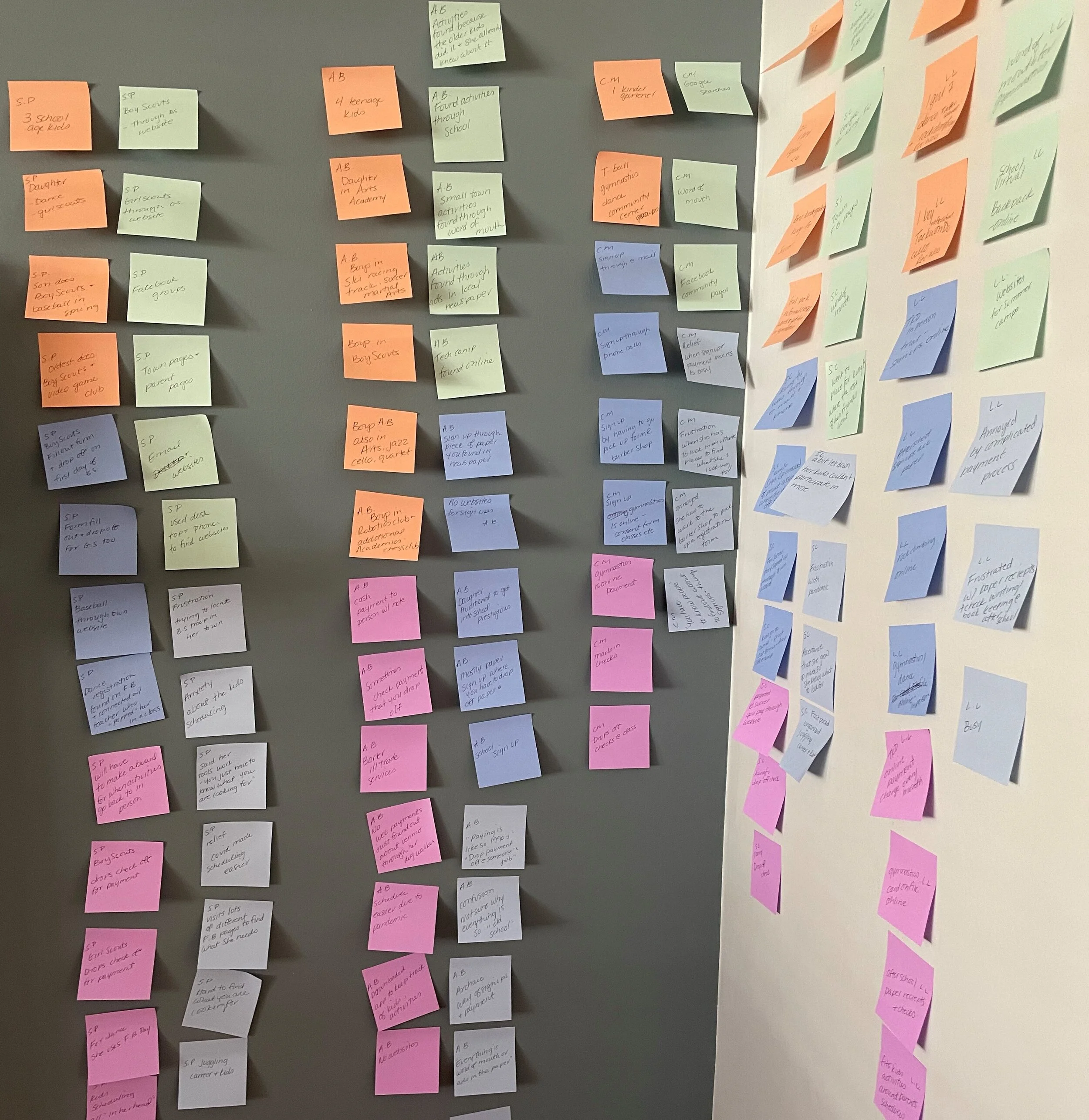
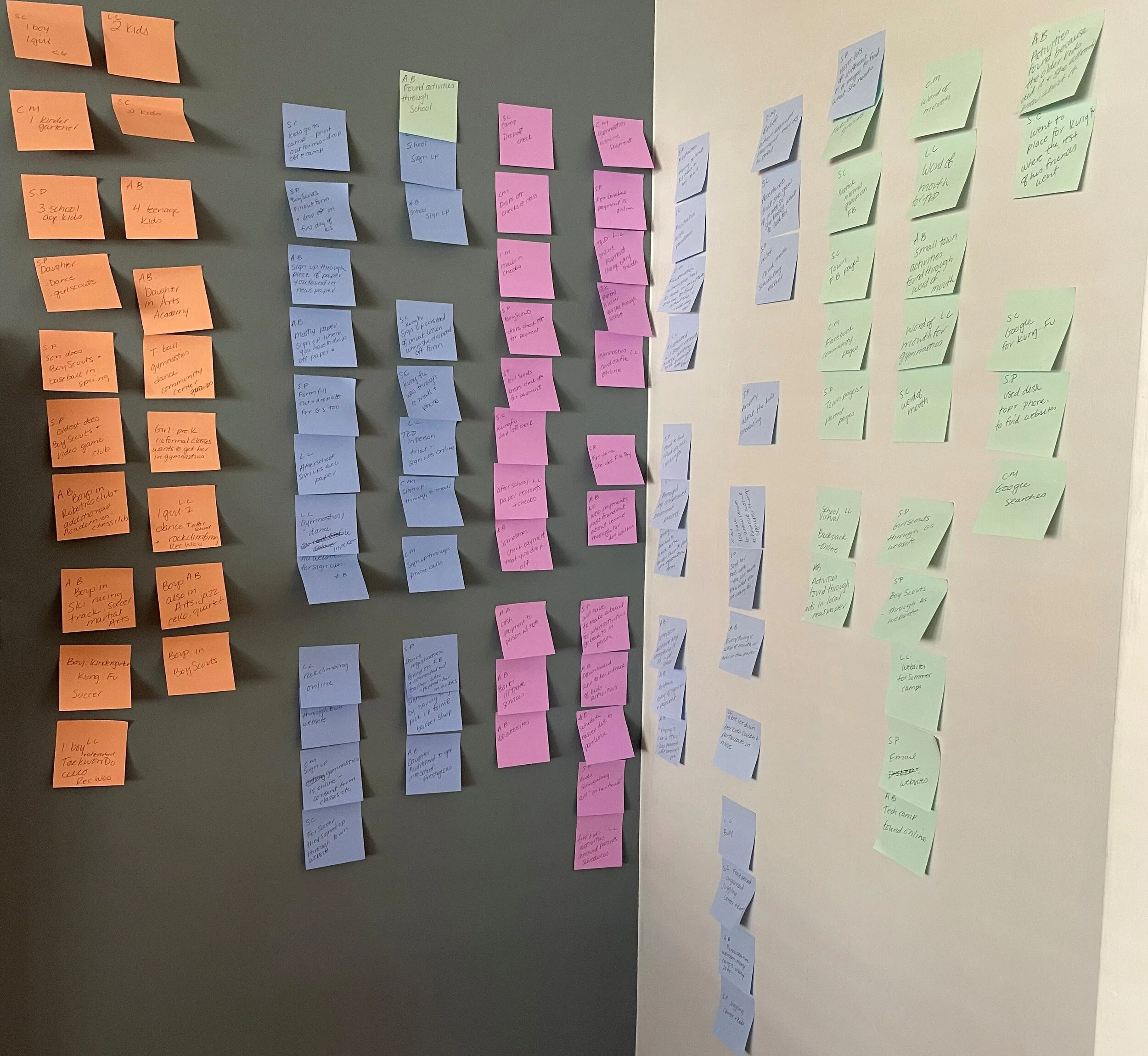
Empathy Mapping
Empathy maps were also developed to use as the foundation for what potential users would do, think, feel and say.

Key Findings

Personas
Eventually, I settled on two main user personas that were carefully crafted through synthesis and understanding of parents’ wants and needs.

Persona # 1
Tamra is the co-parenting career driven user that wants her kids to be more active but just can’t make it happen. Her catch phrase;
“I don’t have time for that.”

Persona # 2
Kayla is the over scheduled, over booked mom who wants her kids to branch out and stay active. But she also wants some reprieve from her hectic days. Her catch phrase,
“Can anything ever be easy?”
Design & Ideate
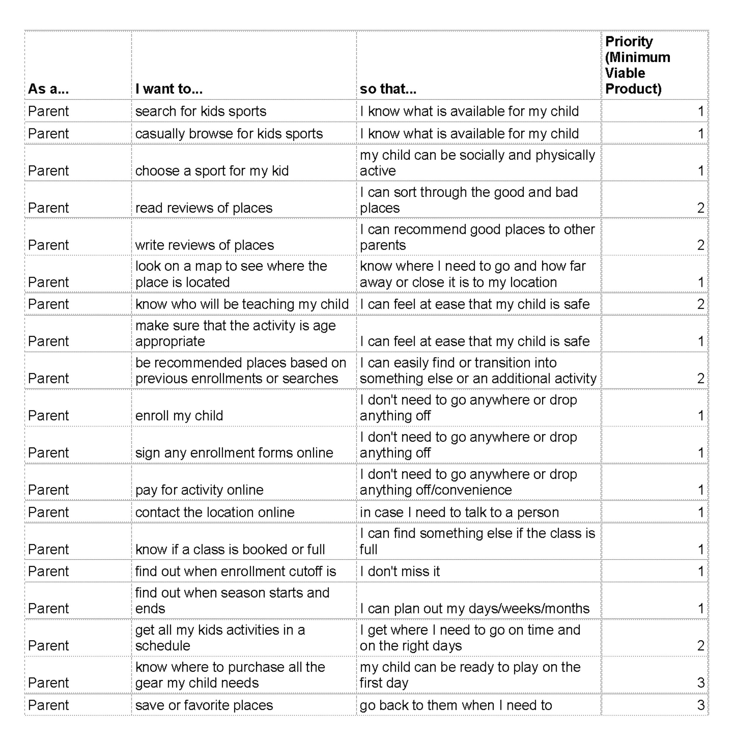
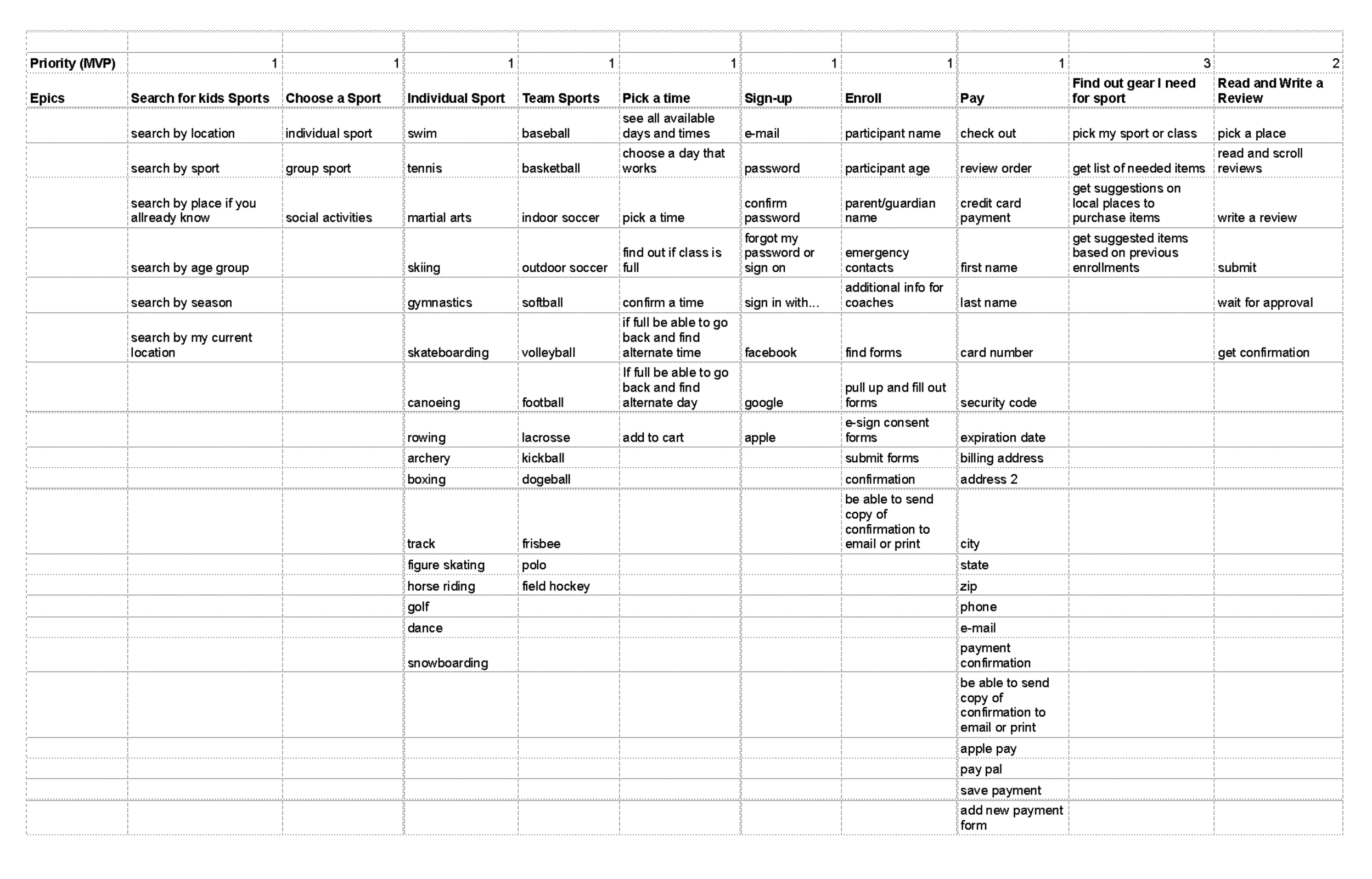
Using what I learned in the discovery phase, I generated some user stories to get a feel for the types of tasks my users are trying to accomplish.
I then used sitemapping to create the blueprint for a potential solution, followed by user flows of my red routes, sketches, guerrilla testing and wireframing.
User Stories & Epics
Must Haves (MVP’s)
Ability to search for an activity
Option to enroll with upfront pricing and availability
Easy payment options
Would Be Nice If…
Read reviews from other parents
Suggest where to get gear
Help with scheduling
Architecture
I used Miro to build a sitemap and organize the needs and wants of users. I made sure to include simple navigation, natural and familiar paths as well as progressive disclosure so as not to overwhelm users.

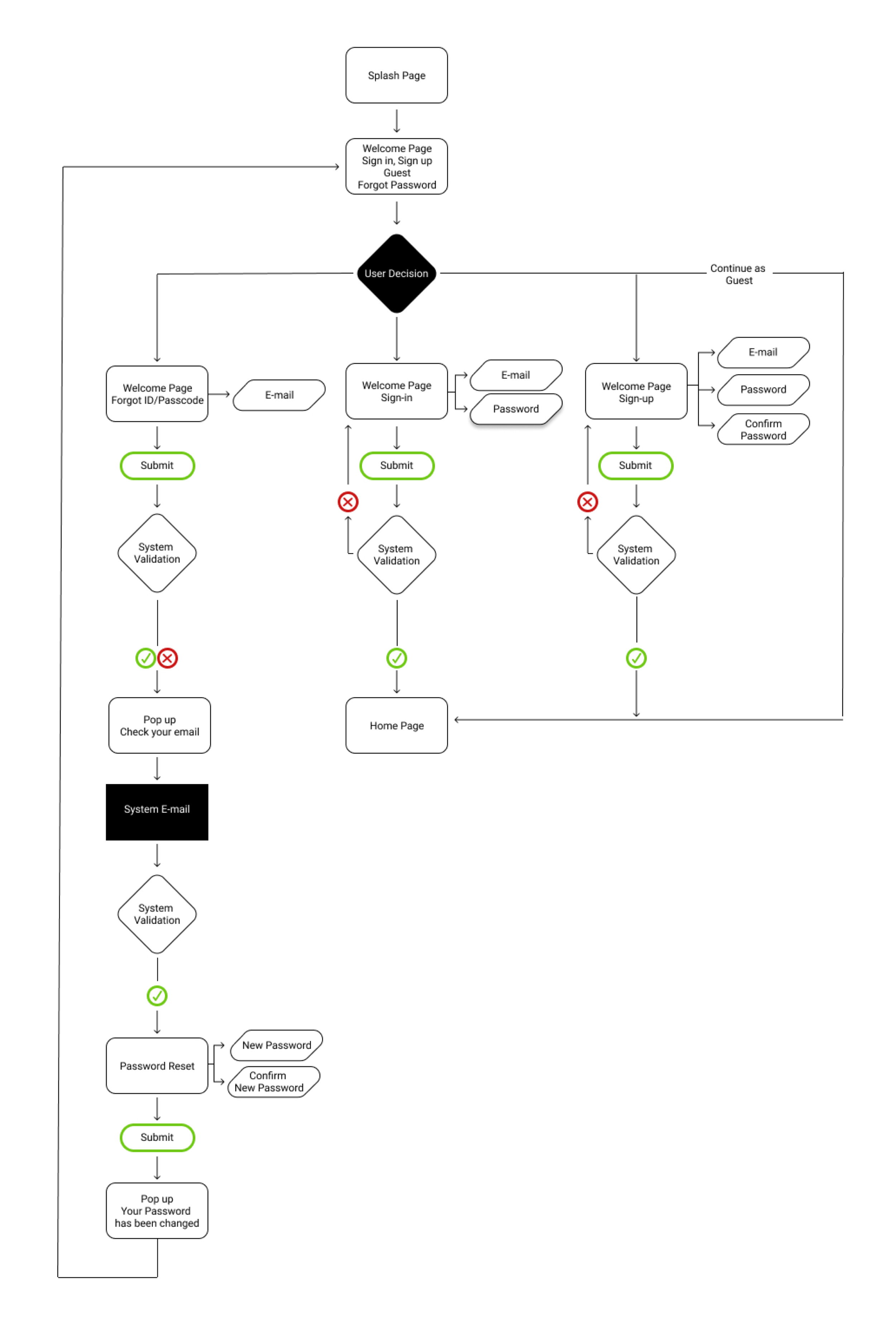
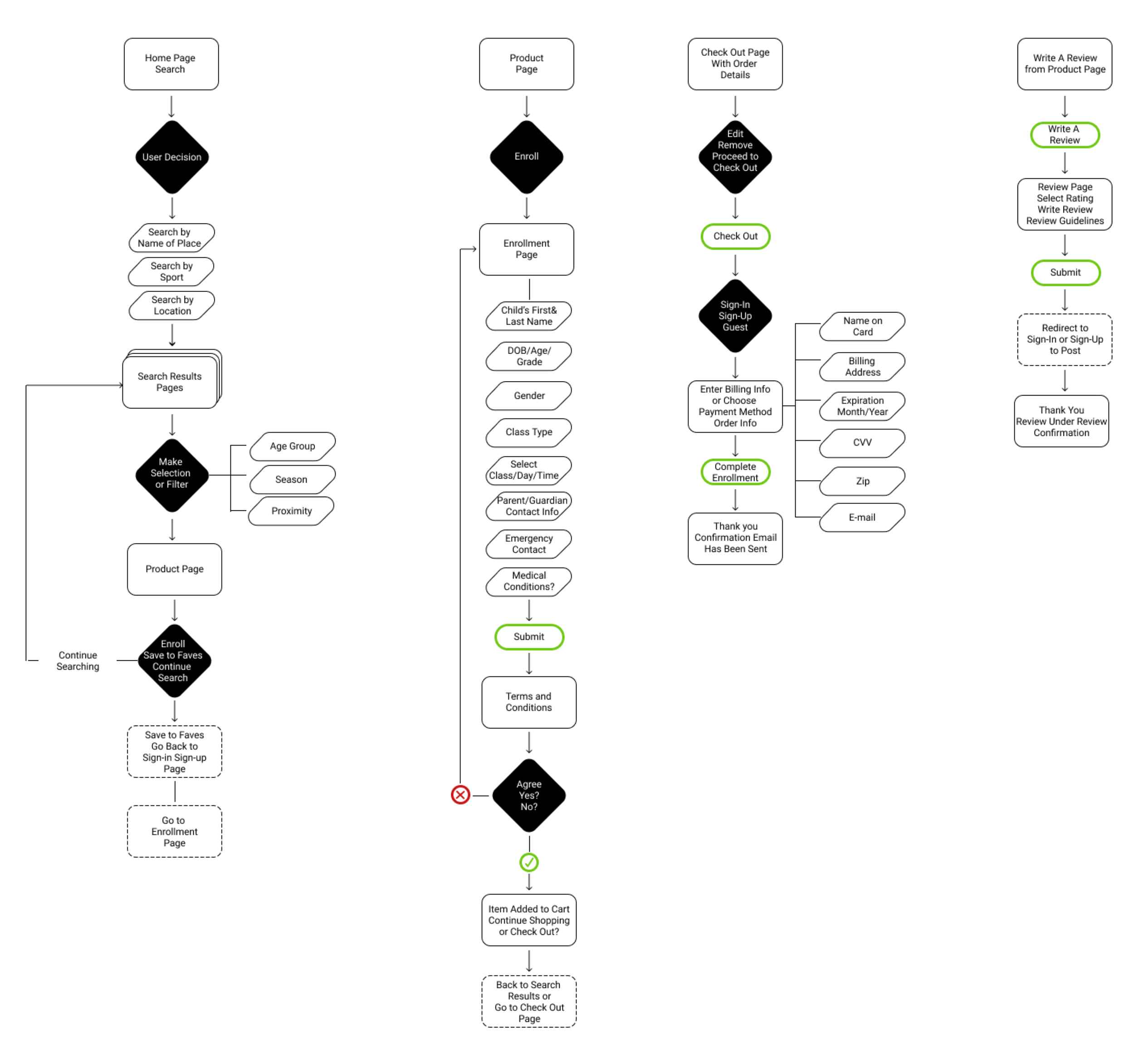
User Flows
When it came to user flows, I identified four main routes that a user could potentially take. As part of the flows, I wanted to include an easy onboarding and a guest checkout option. I was careful to ensure the search process included a search by sport, location and venue.
Red Routes
Login
Search
Enroll
Pay
Sketches
Keeping in mind the concept of “pencils before pixels,” my design process involved a lot of preliminary sketches before any digitized framework came to life.

Guerrilla Testing
Guerrilla usability testing of my sketch prototype revealed clear opportunities for improvement.
Findings
Users wanted email confirmation as proof of payment
Users asked for a more prominent search bar and search results
Users wanted intuitive login and consistent iconography
Wireframes
I implemented learnings from the guerrilla usability tests into the wireframes, creating a more detailed and intuitive experience.

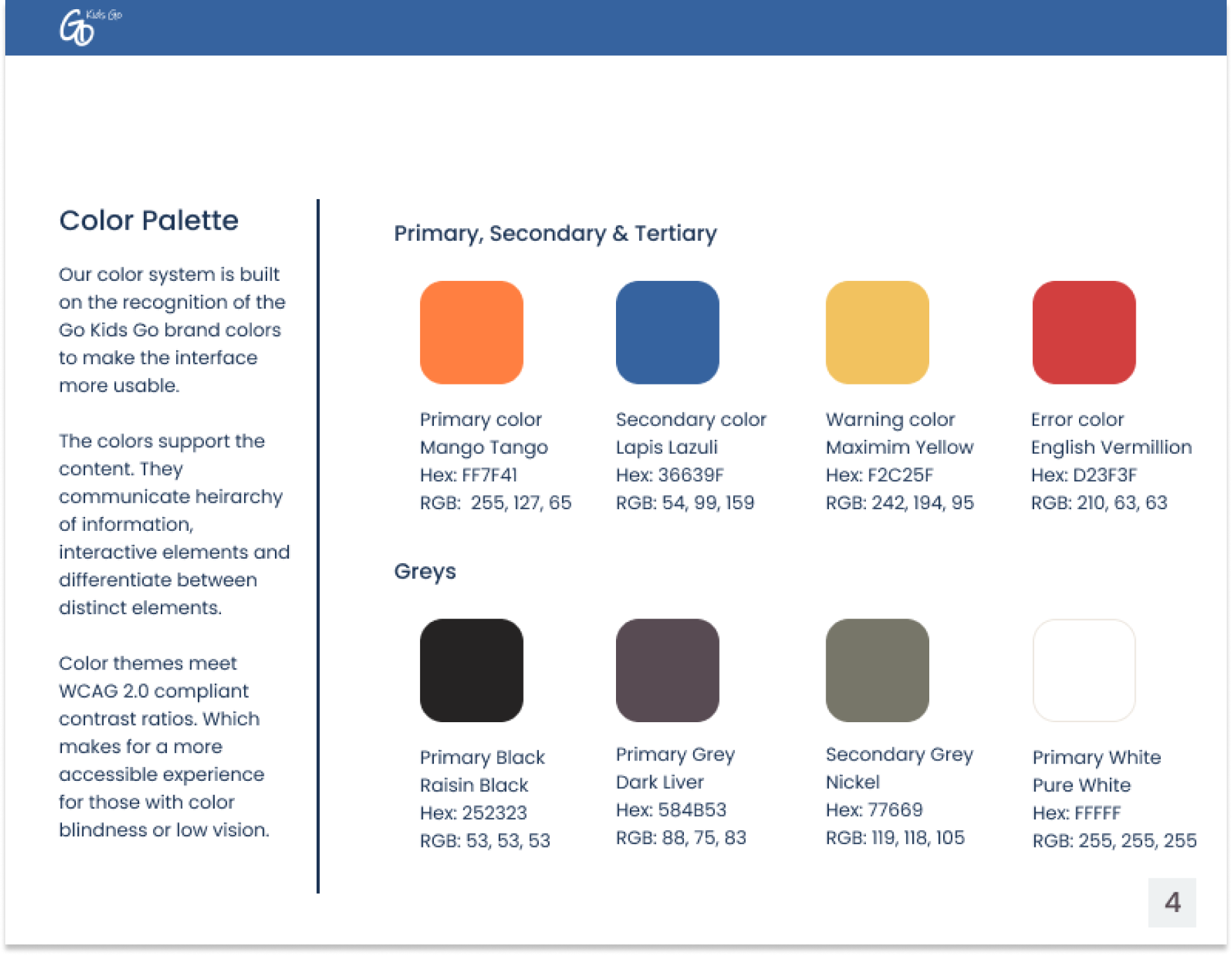
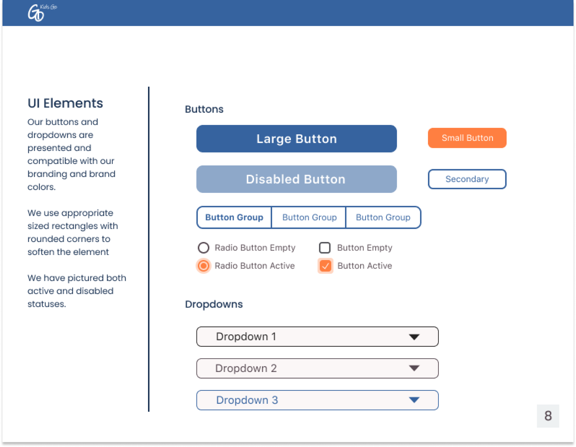
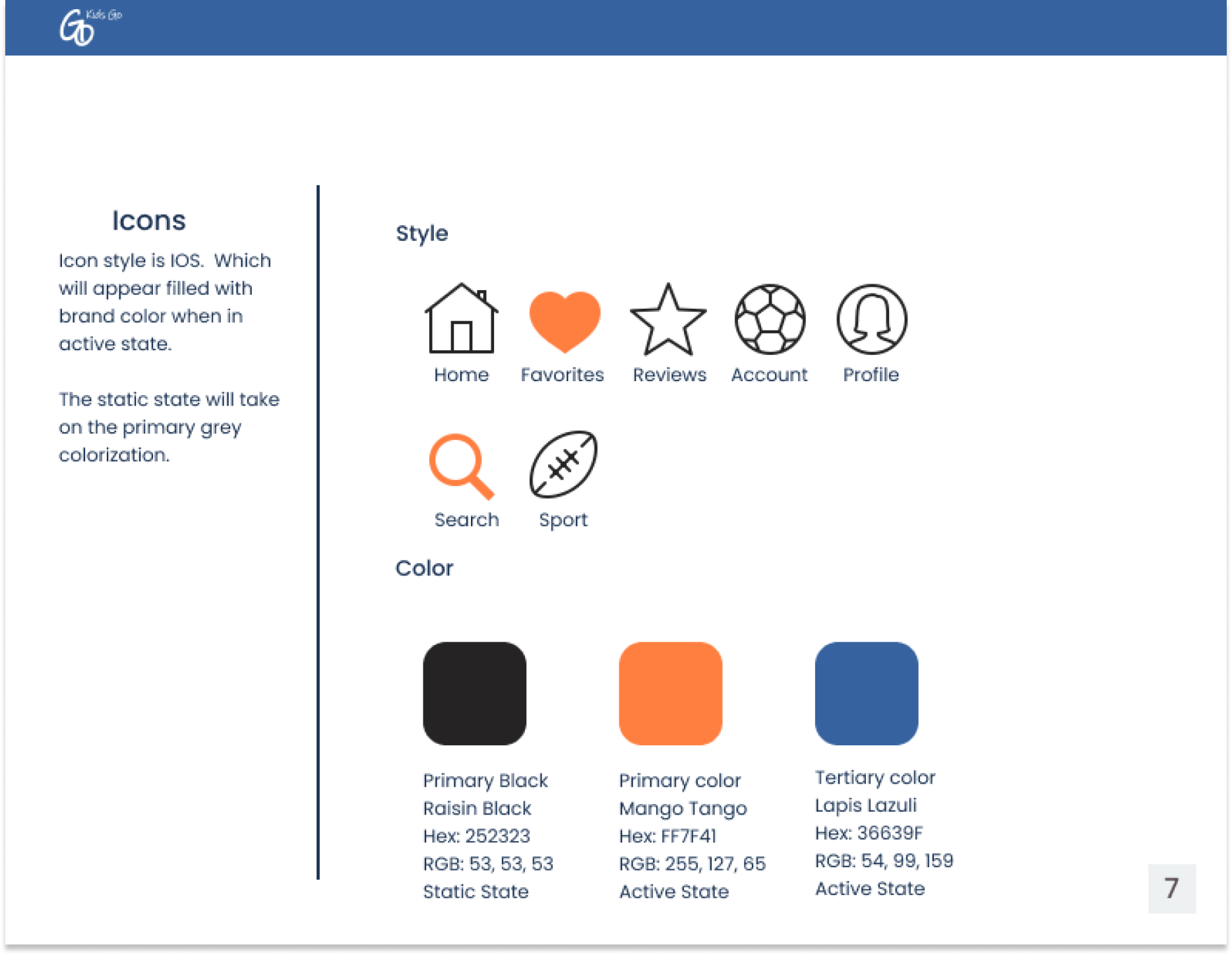
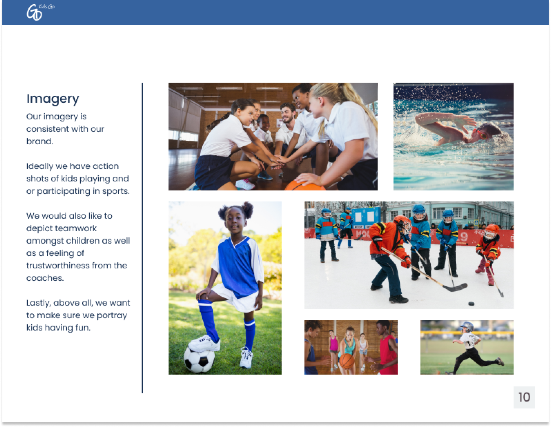
Branding & Style Guide
I wanted to provide GoKidsGo with the right branding to gain trust and convey fun and energy.
Moodboard
Every product needs a strong brand personality to be successful. I pulled inspiration from watching my own child play sports as well as professional sports teams for color and UIs with a fun and energetic visual design.


Logo
“Go Kids Go” was chosen as an ode to a chant one would hear at a sporting event to cheer someone on.
Brand Platform
As a product whose base is parents getting their kids involved in an active lifestyle; I wanted the brand to personify feelings of trust, confidence, fun and energy. This was done through careful consideration of colors, tone and imagery.
Style Guide
I developed a style guide to help developers and designers maintain consistency in branding among colors, UI elements, typography and imagery.
Usability Testing & Final Designs
The final mockups of Go Kids Go were generated with adaptability in mind. I designed for the iPhone 8 as it remains a critical screen size to cater to in terms of ideal responsive design. Through my research I learned that most users remain on smaller screens.
Usability Tests
The first round of usability tests consisted of 5 participants. They were given four tasks; login, search, enroll and pay for an activity. The feedback was clear. These improvements were implemented in the final design.
Round 1
Users wanted the ability to filter search options
Users wanted the ability to add multiple children
Round 2
Requests for more activities associated with arts and music
Ability to share confirmation page
Splash screen, on boarding, login & homepage

Search, results, filters & product page


Enrollment
Child information, parent/guardian info and terms & conditions
Payment
Payment info, order review and order confirmation

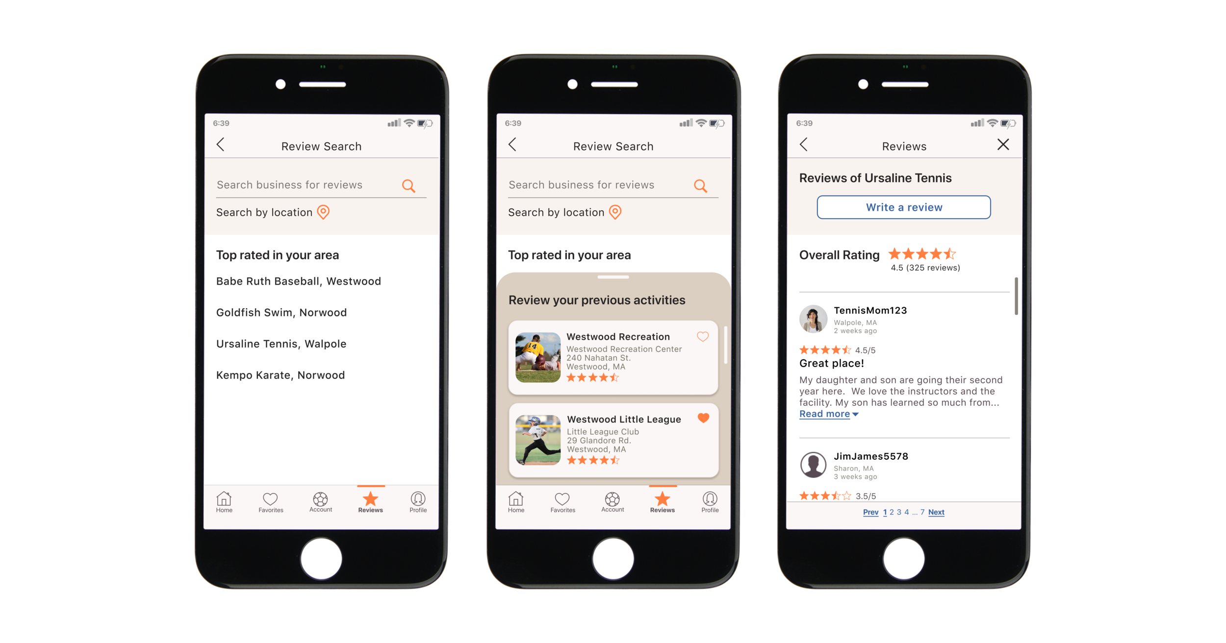
Reviews
Search reviews, search results, read/write review
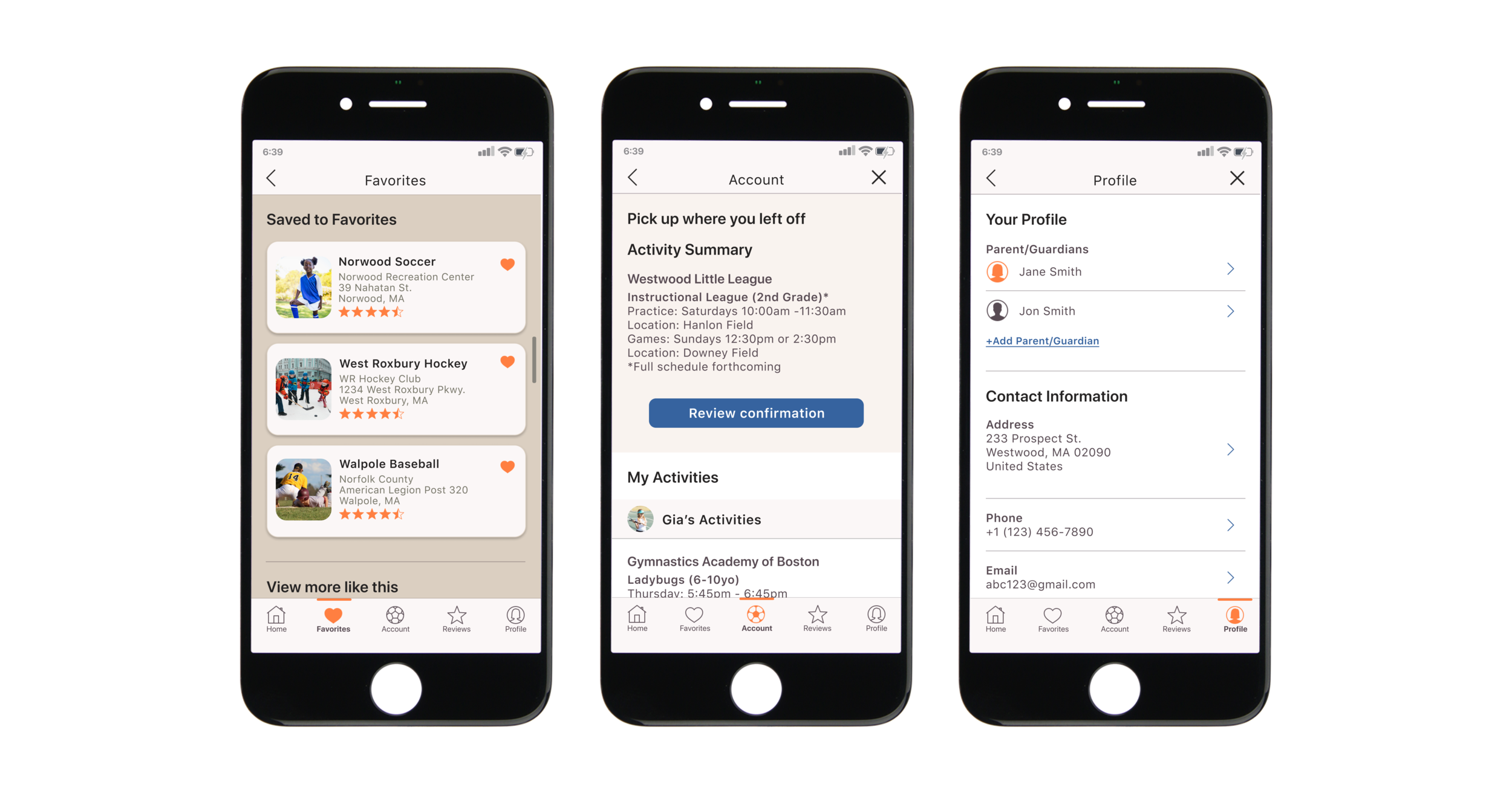
Bottom Navigation
Favorites, accounts, profile
Improvements & Additions
Due to the time constraints of the project, I was not able to iterate as deeply as I would have liked. In the future, I would love to be able to expand beyond sports and include various social, tech and art resources as children have a variety of interests.
Also, I did not include in the initial prototype the “easy checkout” screens for those with profiles to perform an even faster, sleeker enrollment and payment flow.
Lastly, I would like to explore scheduling as I learned early in the research phase that it was also a pain point for parents.
Learnings
I thoroughly enjoyed working on this project and strove to create a platform that would resonate with parents and guardians.
Parents truly want their kids to participate in extra-curriculars but have real world everyday obstacles to overcome in order to make that happen.
I learned that recommendations other parents and social media were the main forms of communication parents used to inform themselves of activities.
Even with modern forms of payments some providers still opt for cash or check only and even barter options.
As the sole designer of this project, it was both fantastic and challenging at the same time. I was able to make quick design decisions on my own but I also didn’t have anyone to bounce ideas off of. However, I was thankful to gain feedback from peers and my mentor.