Find the best photo-ops, wherever you are: GramCity case study
This case study features a Bitesize UX challenge. Take a journey with me on this solo mission GV Design Sprint to help people find the most Instagram-able photos in any city.
Background
After reading Jake Knapp’s Sprint book, I decided to embark on my own GV Design Sprint where I embraced the featured challenges in Bitesize UX. GramCity was presented as a photo editing app looking to explore how and where they can help users find amazing photo-ops near them, wherever they are.
The Problem
As a traveler exploring a new city, you want every opportunity to get the most out of your trip. That includes, food, culture and of course, the perfect Instagram shot. There are several mobile apps dedicated to help find amazing restaurants, hotels and cultural epicenters, but limited resources if you are looking to find the “perfect shot.”
How might we help travelers in a new city locate the best photo-ops near them?
The Solution
I designed the solution as a feature on the existing GramCity platform. It focuses on using your current location in determining and then showcasing on a map the most Instagram-able photo ops nearby.
Target Audience
The added feature in GramCity was designed with travelers in mind. The premise being that you can find an awesome place to take a photo, wherever you are. I wanted to cater to the social media savvy. The busy, agenda driven traveler as well as the more casual visitor just looking for a great photo-op along the way.
Role
As the sole designer on this design sprint I was responsible for all aspects of the project. I handled the ideation, development, designing, prototyping and user testing.
Day 1 - Map
Understanding The Problem
Bitesize UX presented a brief which included a project overview, certain research as well as personas. I synthesized the interviews using affinity mapping to extrapolate key topics, insights and pain points.
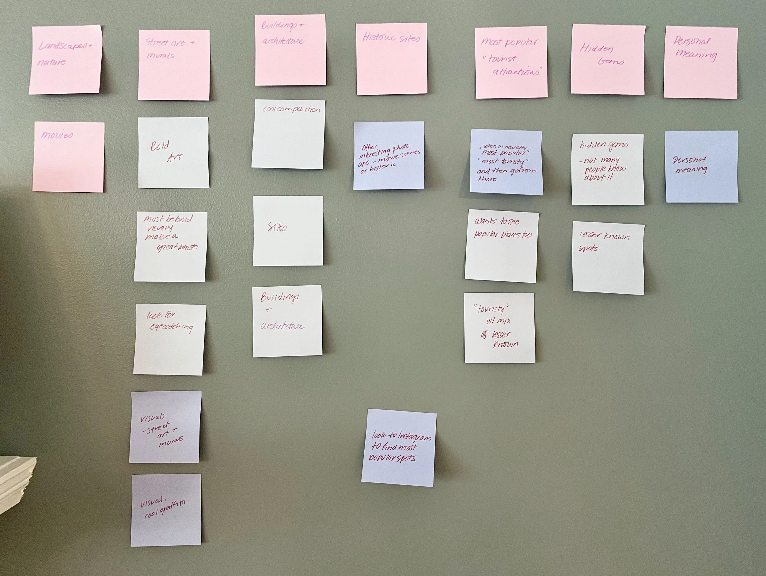
Key Topics & Insights
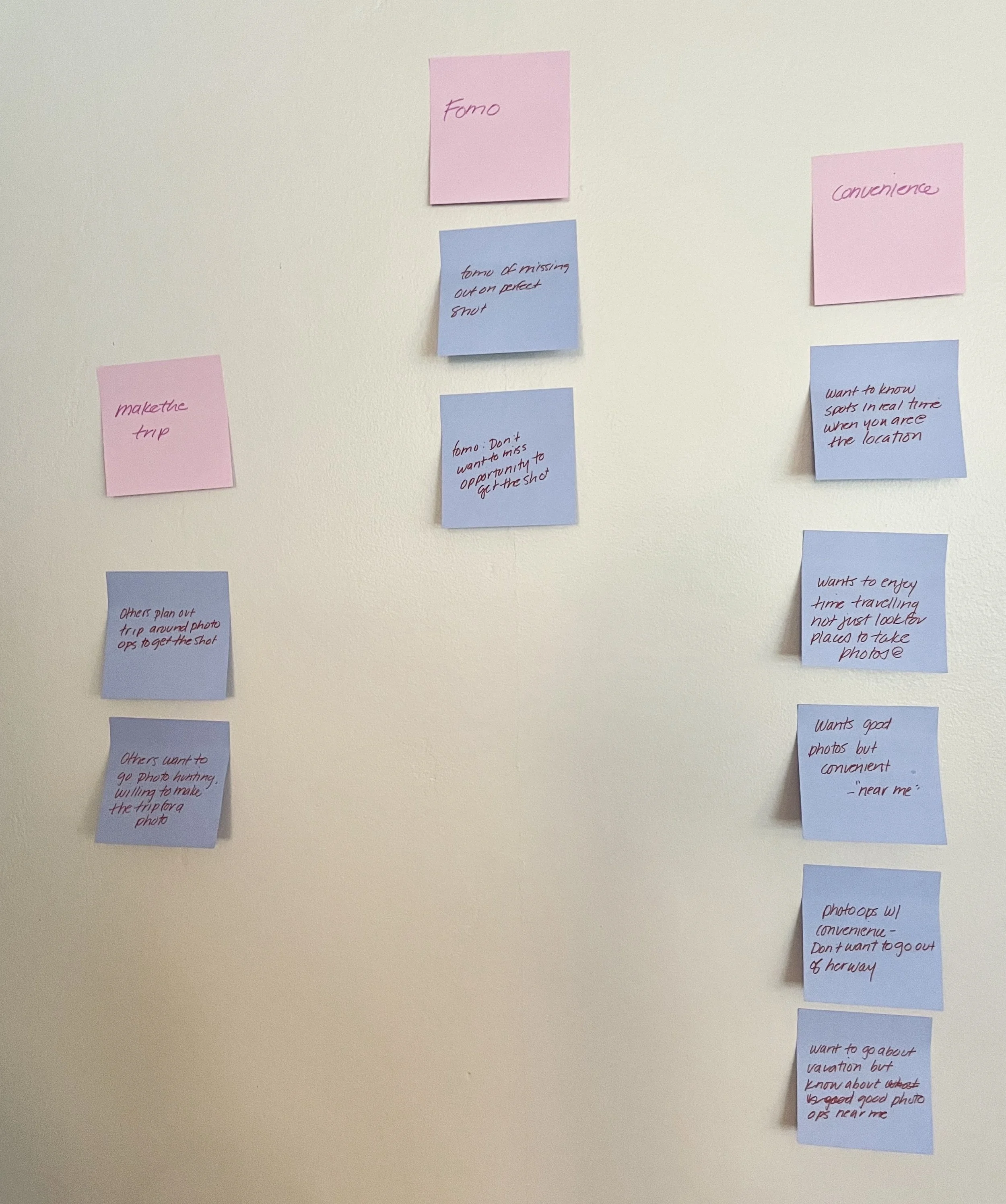
FOMO: Users have a real fear of missing out on “the perfect shot.”
It is difficult to take the time to research and find ideal photo-ops in a new area and whether or not they are worth taking the trip for.
Travelers want the convenience of knowing exactly where to go and what is available to them nearby.
Travelers have a wide range of tastes in terms of the types of photos they deem Instagram worthy.
User Map
Using Figjam, I drafted a couple end to end scenarios to understand the possible journeys a user might take to complete their task. I created two maps, one for each persona.

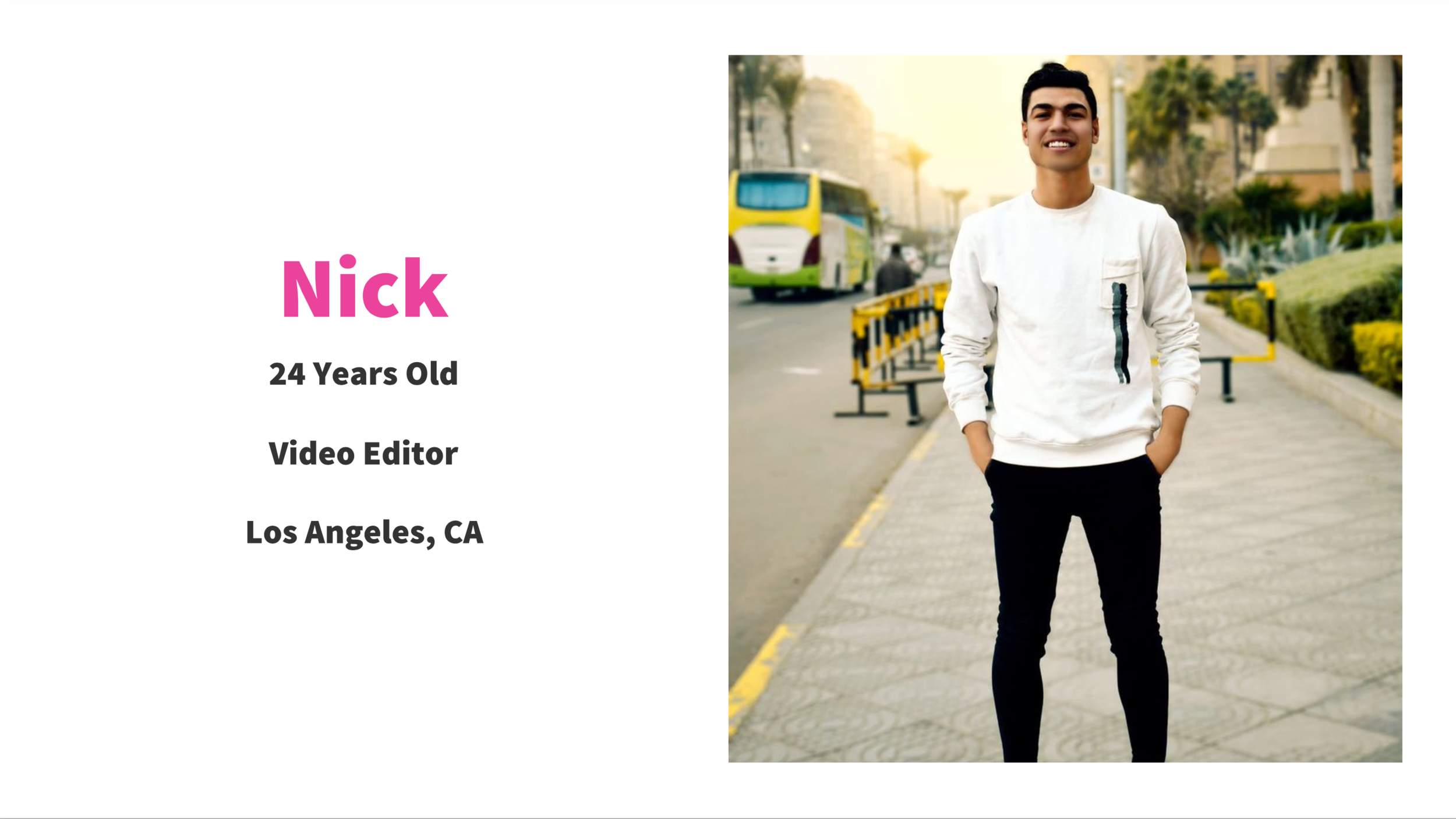
Persona # 1
The Convenience User
The avid traveler who loves to take and share photos while exploring a new city. This user doesn’t stick to an agenda but rather goes with the flow.
The convenience user wants to take lots of pictures but feels as if they’re missing out on the travel experience if they’re constantly on their phone.
They wish they knew of photo ops that are already near them without having to do endless research.

Persona # 2
The Planner
This traveler is a planner and already knows where they’re going, what they’re doing and what they will see when they get to their destination.
The planner spends a lot of time looking at other people’s photos to find places they want to go. If it’s a lesser known place, determining how to get there could be difficult and require some research.
They wish they could find locations and examples of the best photo ops before planning out a day to visit them.
Day 2 - Sketch
Deciding What To Build
I realized I could combine the user maps. Through my synthesis I learned the two essentials of the feature would be discovery and navigation.
Users want to be able to discover what is around them.
Users want to be able to navigate their way to the physical location of the photo opportunity.
Lightning Demos
Just as the experts at GV suggest, I gathered inspiration from other existing apps. This included all types of apps, not just limited to photo editing and navigation.

I looked to Yelp, a hiking app called AllTrails which helps you find nearby trails, AirBnB, Instagram and Google Maps of course.
What I was searching for was inspiration on how to present, explore and navigate to all the options nearby. The standard seemed to be a “your location” icon with all the “discoverable” icons on a map.
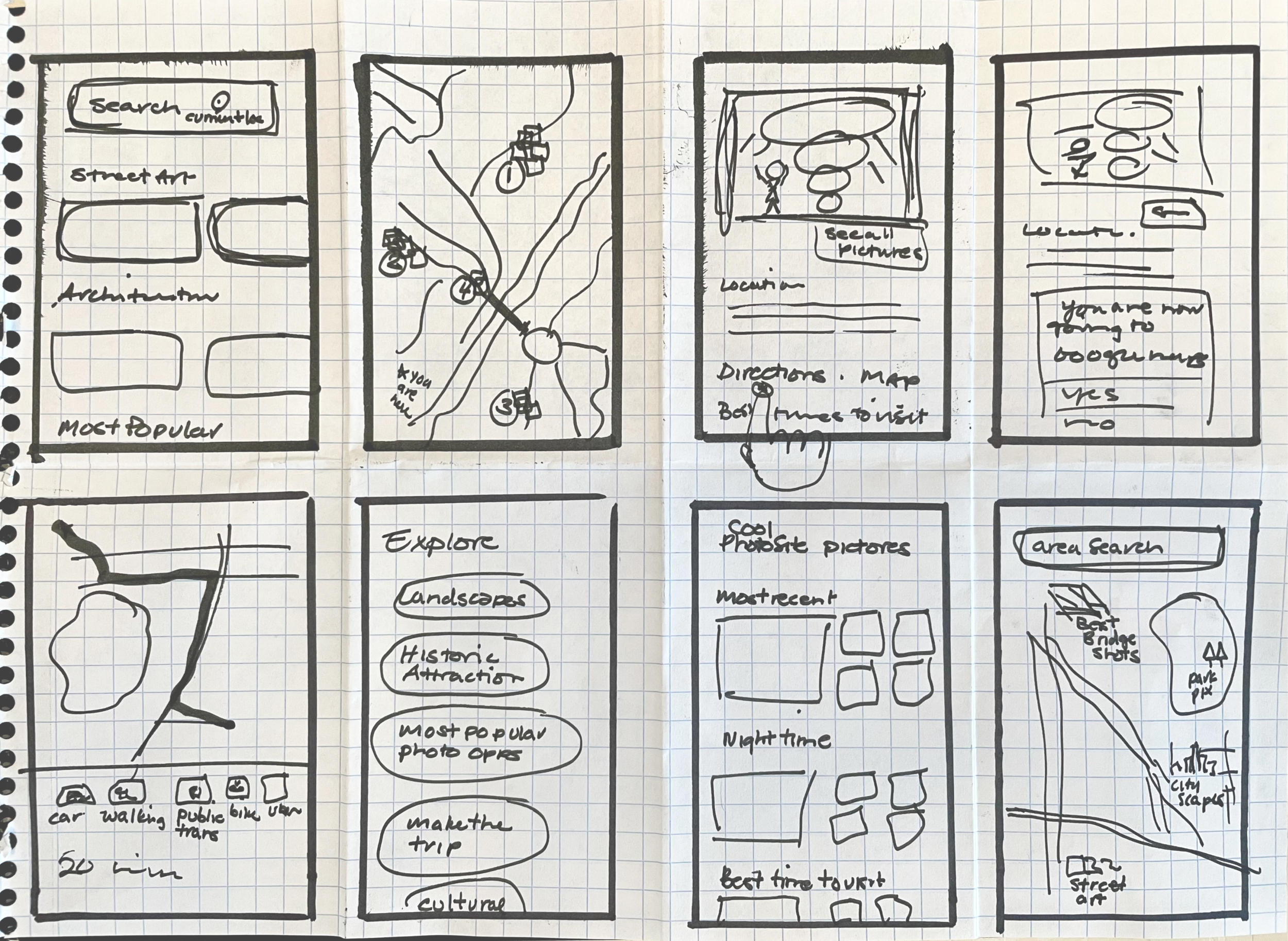
Crazy 8’s
Once I determined how I wanted to present options and navigation. I narrowed down my ideas and got to sketching. I spent 8 crazy minutes hashing out 8 different variations for the screens.
Day 3 - Decide
Storyboarding A Solution
I chose three main sketches to focus on as my solution. I then created a storyboard to show how the user will flow through the prototype. As GV describes, I swam a little “up stream” for my opening scene.
“If you’re prototyping an app, start in the App Store. If you are prototyping a new cereal box, start on a grocery shelf... The trick is to take one or two steps upstream from the beginning of the actual solution you want to test.”
Solution Sketch
The journey started with a splash screen right into the photo-editing feature of the app as it was previously determined in the GramCity brief that that is its main function.

Day 4 - Prototype
Building It
I wanted to make sure that I was able to build only the key screens in order to test my design. The goal was to work fast and lean while making the design somewhat realistic.
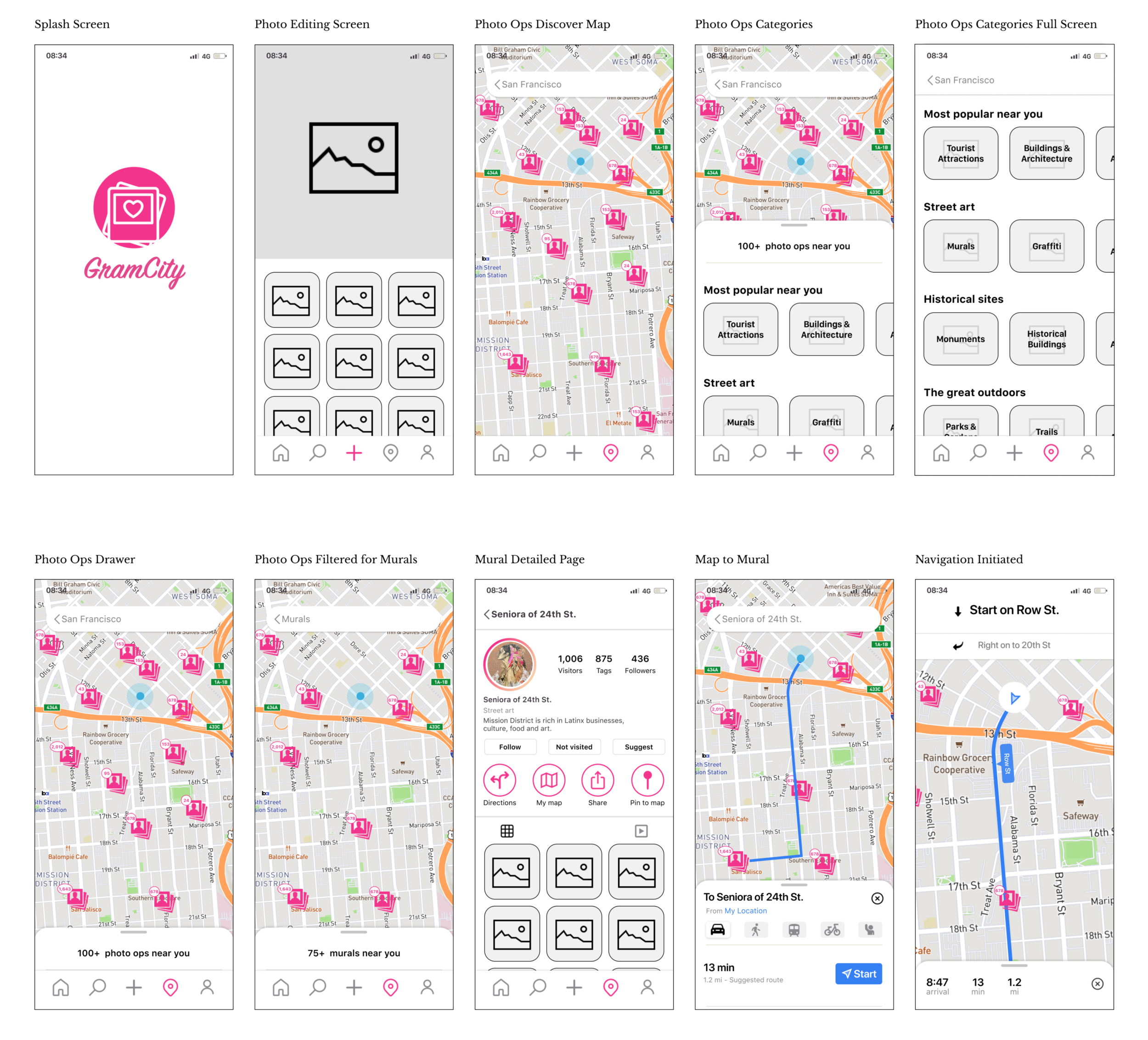
Wireframes
I built the screens using Figma. I was looking to quickly test the basic functionality and usability of the feature so I used image place holders for the time being.
Day 5 - Test
Participants
I recruited 5 participants who were familiar with photo editing apps as well as social media savvy.
Tasks
Participants were given 4 tasks.
From the photo editing screen, find where you can locate photo-ops near you.
Select a category you would like to see (murals).
Try to learn more about a particular mural.
If you wanted to go see this mural, how would you go about doing so?
Feedback & Findings
Results were mixed. Moderated remote user tests proved to be more challenging as the animation meant for a mobile app, specifically the “drag” feature was confusing to someone on a laptop or desktop computer.
All in person tests were done on a mobile phone and those participants were able to complete the tasks with minimal friction.
Lastly, some users wanted to click on the “search” icon when asked to complete the initial task of “find where you can locate photo-ops near you.”
I was able to incorporate some of the feedback into the final designs.
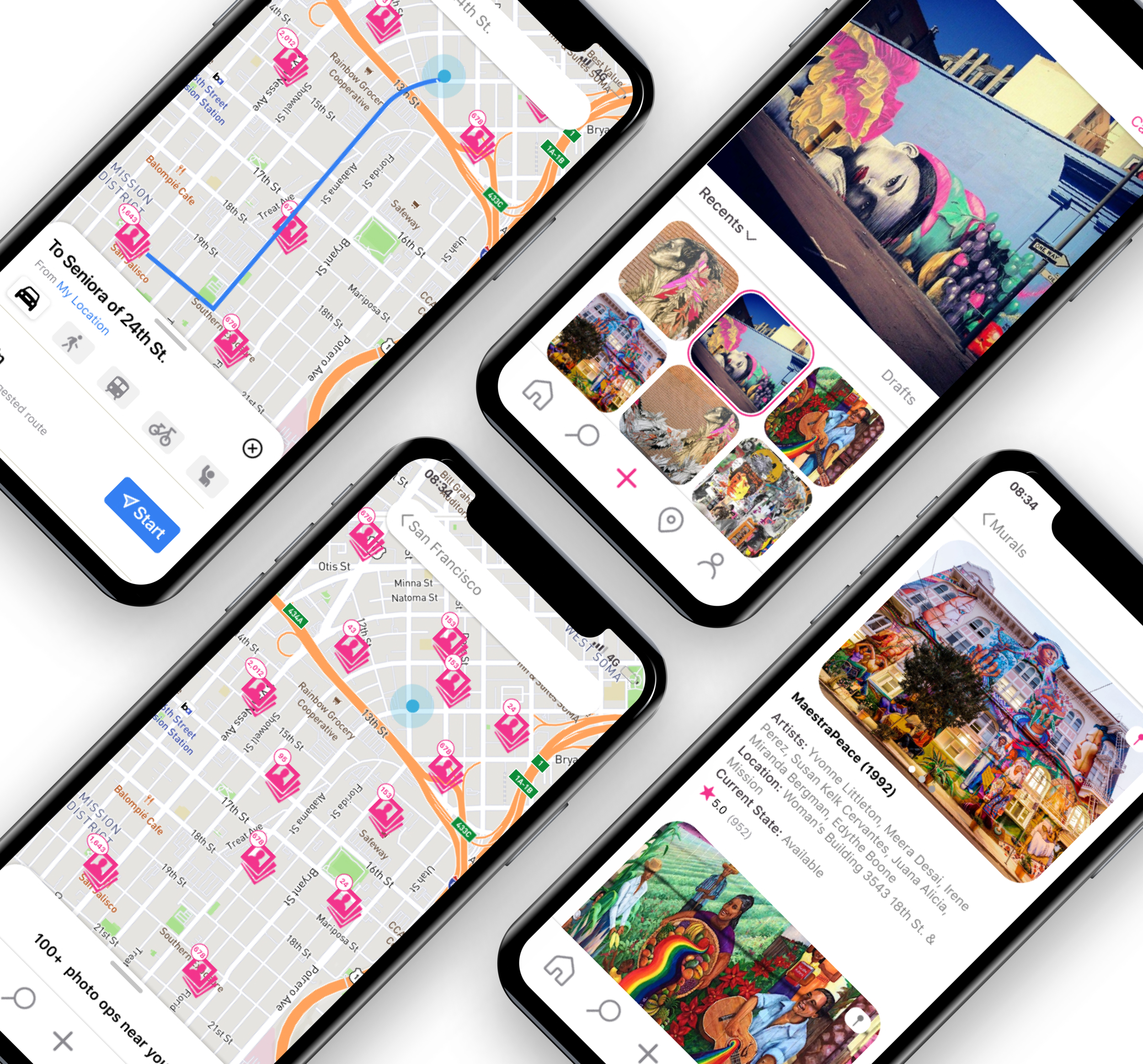
Final Designs
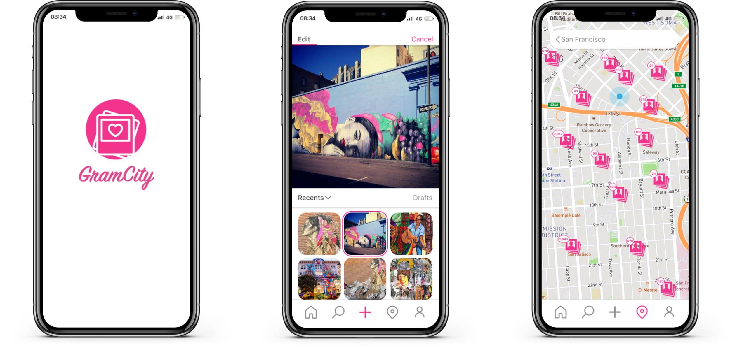
As I did in storyboarding, I kick off the prototype with the GramCity splash screen followed directly into the photo-editing feature. I wanted to make sure that as a new feature, the location based photo-op search was discoverable on the app.
A location icon on the bottom navigation bar is used to represent the added feature. Once initiated, the base is a map of your location with all the photo-ops around you depicted as photo gallery icons.
Filter
I learned early on in the research that travelers have a wide range of tastes in the types of photos they are looking to take. I understood that a filter option was necessary to categorize the plethora of options out there.

Narrow It Down
Filter options allow the user to narrow down their choices for photo opportunities that pique their interest. For the purpose of this prototype I chose to expand on the “murals” category.
Depending on the selection the user makes, the photo map will update showing only the “murals” nearby. A drawer slides in, giving the user the opportunity to take a closer look before making a selection. The user will have the ability to dismiss the drawer but it will rest along the top of the navigation bar if needed.
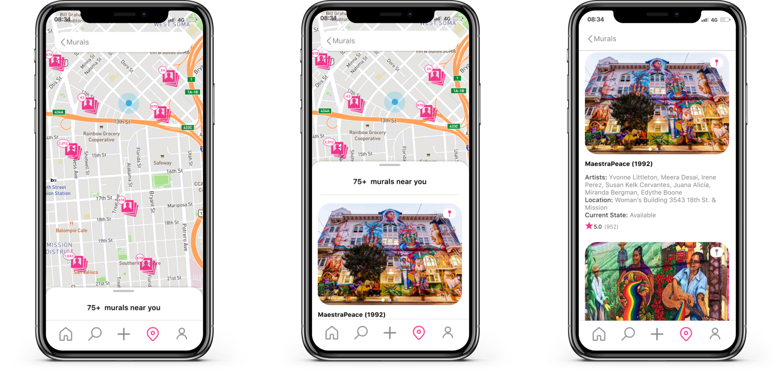
Product Page & Navigation
Once a selection has been made, either on the map or from the drawer, the user is taken to the product page where they can scan a gallery of photos to determine whether the mural is picture worthy.
If deemed “Instagram-able” the user can then choose to get directions and start navigation to the desired destination.

Learnings
I wanted some feedback on the final designs, so I tested again with some peers. I had them repeat the same tasks from the first round of testing. Overall, users were surprised and delighted to discover all the Instagram-able moments available in their proximity without the need for extensive research.
They expressed their appreciation for the level of detail regarding the sites and wanted to learn more about the surrounding area.
“I like that this is giving me details on the murals, like who the artists are and what’s around the neighborhood, like what if I wanted to grab a cup of coffee around there, can this show me that too?”
I learned that copy is king, the need for micro copy on the navigation bar cannot be overlooked.
Users expressed their enjoyment for a familiar pattern of icons on a map to find a location they were looking for.
The ability to narrow down photo-ops by category was crucial as I noticed each participant was drawn to something different.
Lastly, the animation issues during initial testing were resolved by simplifying the animation for those particular screens.
Final Thoughts
The sprint was a refreshing change of pace. I truly enjoyed the experience of being able to discover, define, ideate, prototype and test all in one week.
The one caveat of course being that it was a one man show. Ideally the sprint would be a team effort where everyone would bring their ideas and skillsets to share.
Given the tight schedule and team (or lack thereof) constraints, I certainly would have liked more time to fine tune the design, but I suppose that is all part of the process. Until we sprint again!