KnowRX Health landing page redesign
KnowRX Health delivers diversity and patient engagement to clinical trails for better health outcomes.
Background
I had the opportunity to work with KnowRX Health as a part of Techstars. KnowRX Health is a company that delivers clinical trial recruitment solutions that are inclusive and representative of a diverse population as well as expeditious and cost efficient. The goal of this company is to drive diversity in clinical trial recruitment and deliver data that is representative of the population they are serving.
My role as product designer was to redesign their landing page. KnowRX Health required a site that could be used as a gateway for users to navigate through KnowRX products and for new combers to better understand how they can serve consumers and healthcare organizations.
The Problem
Brought on by Techstars to accelerate growth, KnowRX Health needed a way to clearly convey added value, benefits and products. I needed to better define the brand, its imagery and messaging to appeal to its target audience.
The Solution
I designed a solution that would appeal to consumers, as well as healthcare providers and organizations. I incorporated a strong tagline and a clear call to action above the fold. I then sourced brand right imagery and worked through the copywriting to convey clear, concise messaging through out. I also made sure to identify clear paths for each type of user to be able to navigate their way through the site.
Understanding The Problem
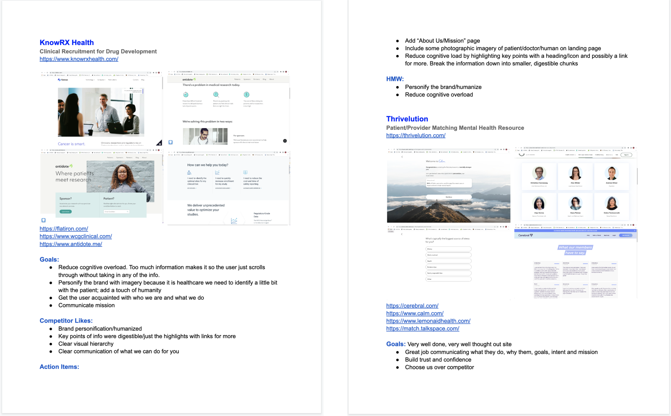
It was important that I understand the problem and domain first. I started with some competitive analysis of other sites and documented goals, competitor likes and dislikes, action items and HMW questions.

Action Items
Reduce cognitive load of current landing page. Break information down into smaller, digestible chunks.
Personify the brand with imagery, add a touch of humanity. Make use of brand assets
Communicate mission and strengthen messaging
Create visual hierarchy
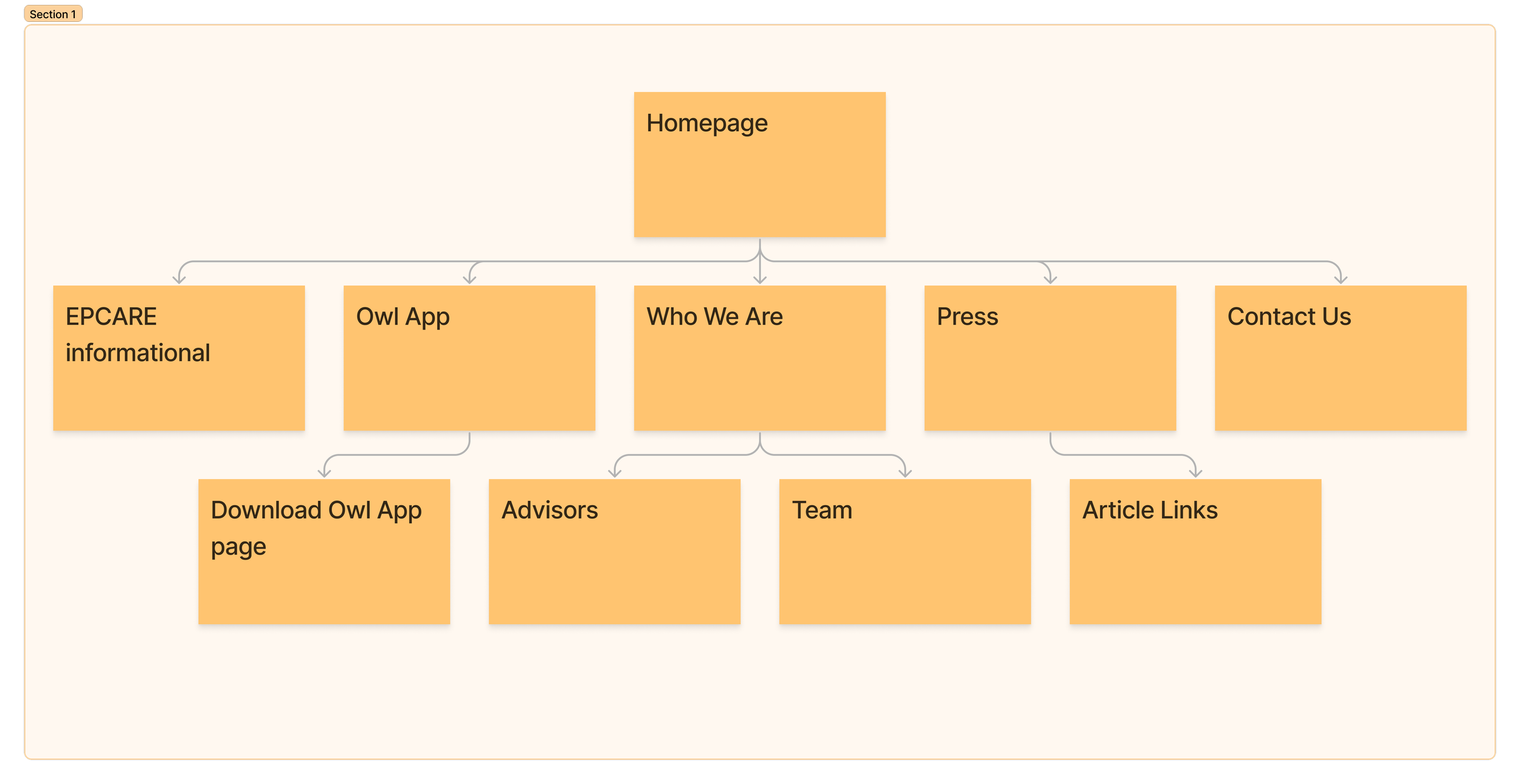
Sitemap
I used Figjam to make a quick sitemap to better understand the architecture, and what actually needed to be included in the homepage.

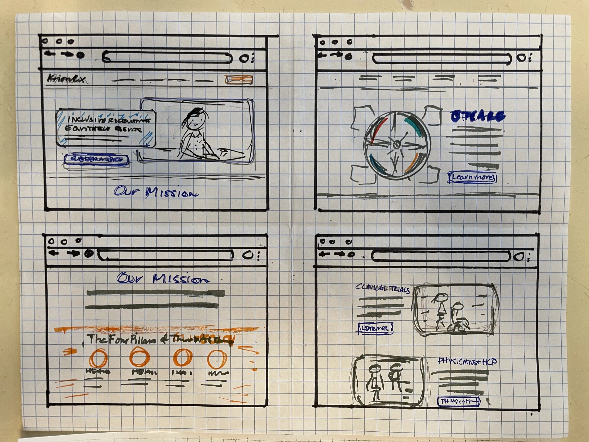
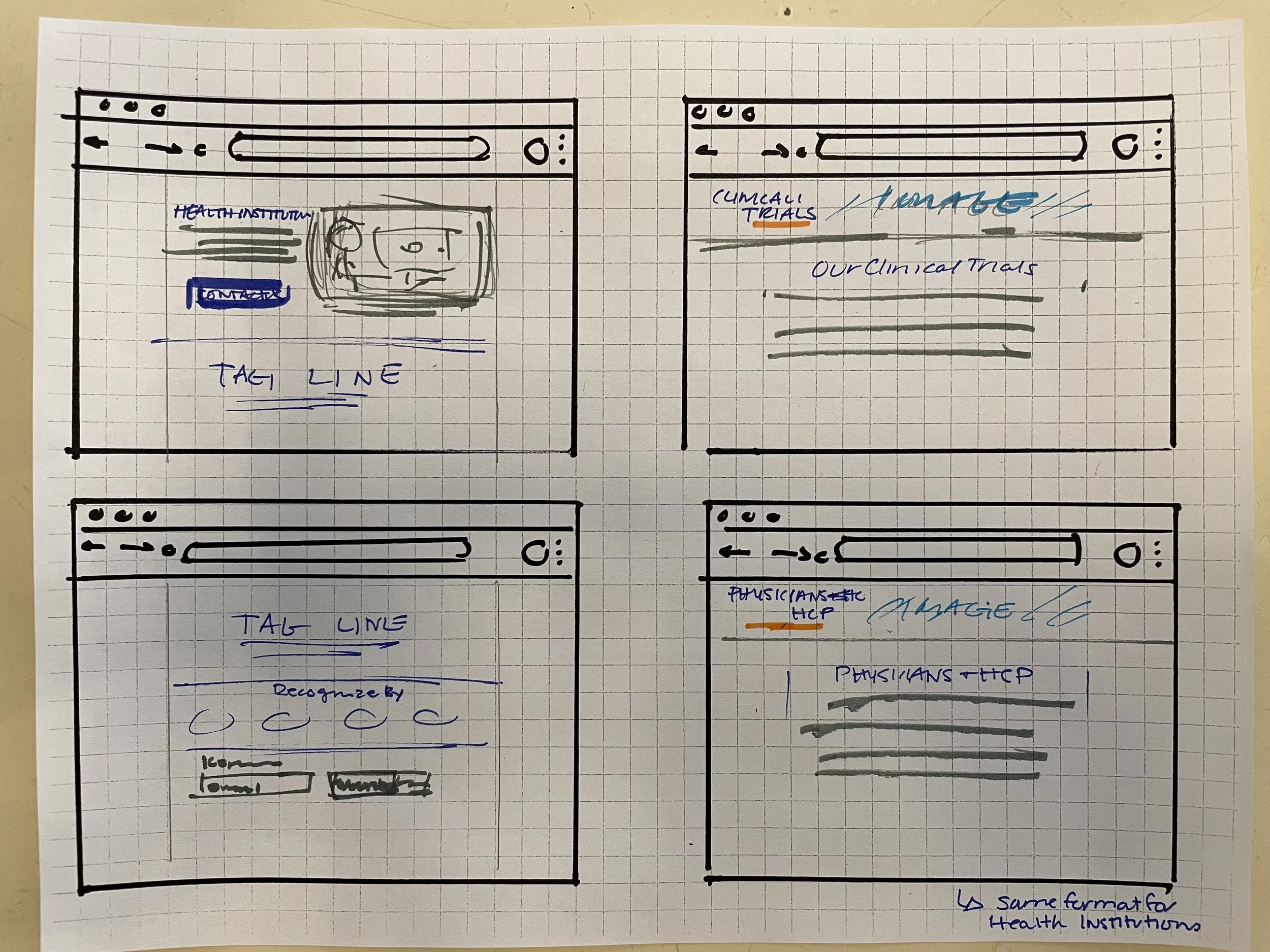
Sketches
I got to sketching to get my thoughts on paper. I included a hero image and CTA above the fold which was not included in the original design. I wanted to make sure to catch users’ interest straight away. I also made room for imagery and supporting copy to cut down on all the verbiage in the current design.

Before The Build
After I sketched out the framework, I got to work sourcing brand right imagery and started the initial design in Figma. I knew I needed a strong hero image with a clear call to action. Luckily, KnowRX had a style guide with a well defined brand, palette, logos and typography to work with.
I also focused on reducing the amount of copy on the landing page, by limiting cognitive load we can help the user better understand the messaging and services of KnowRX.

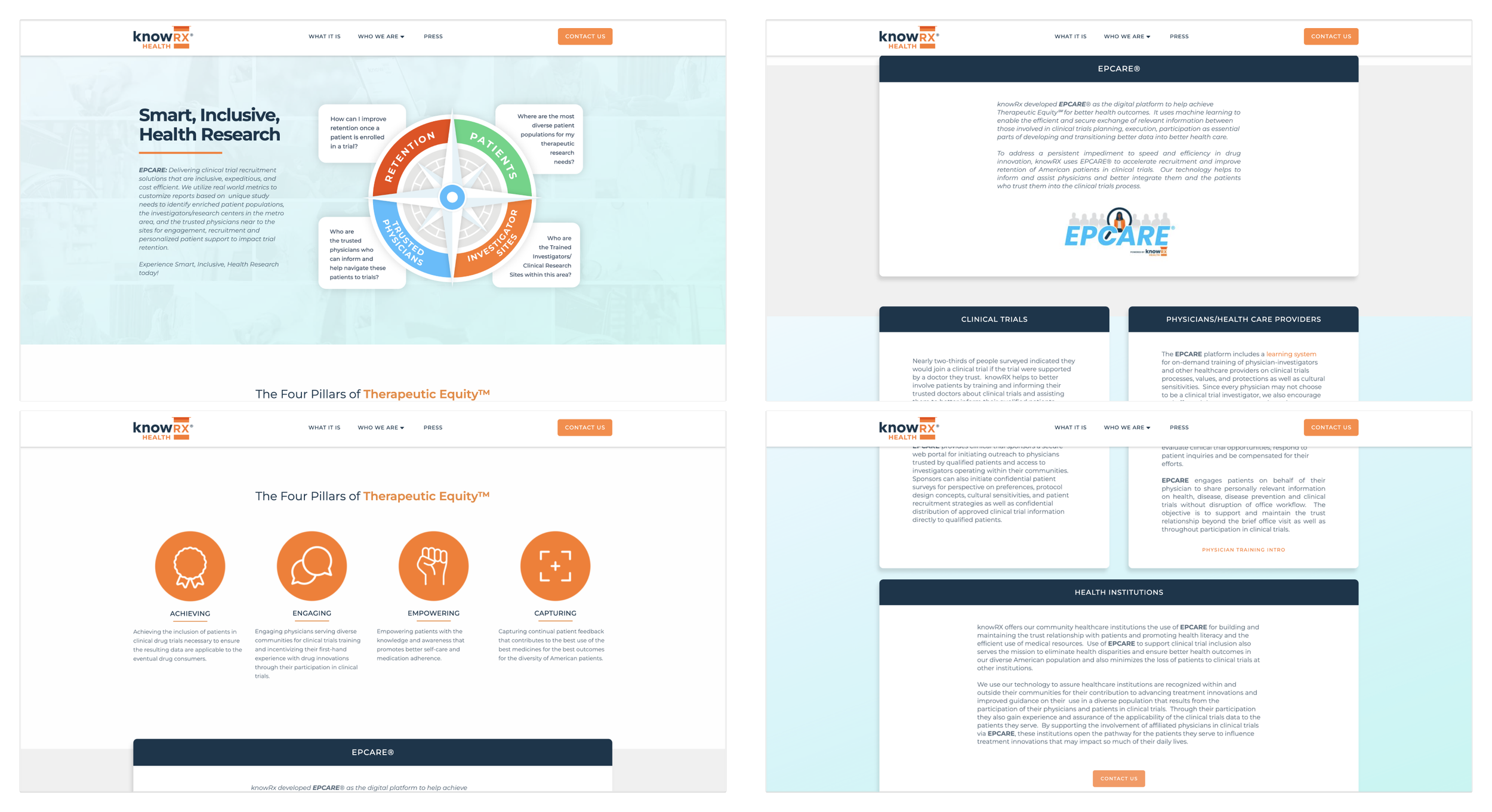
Before Screens
The Build
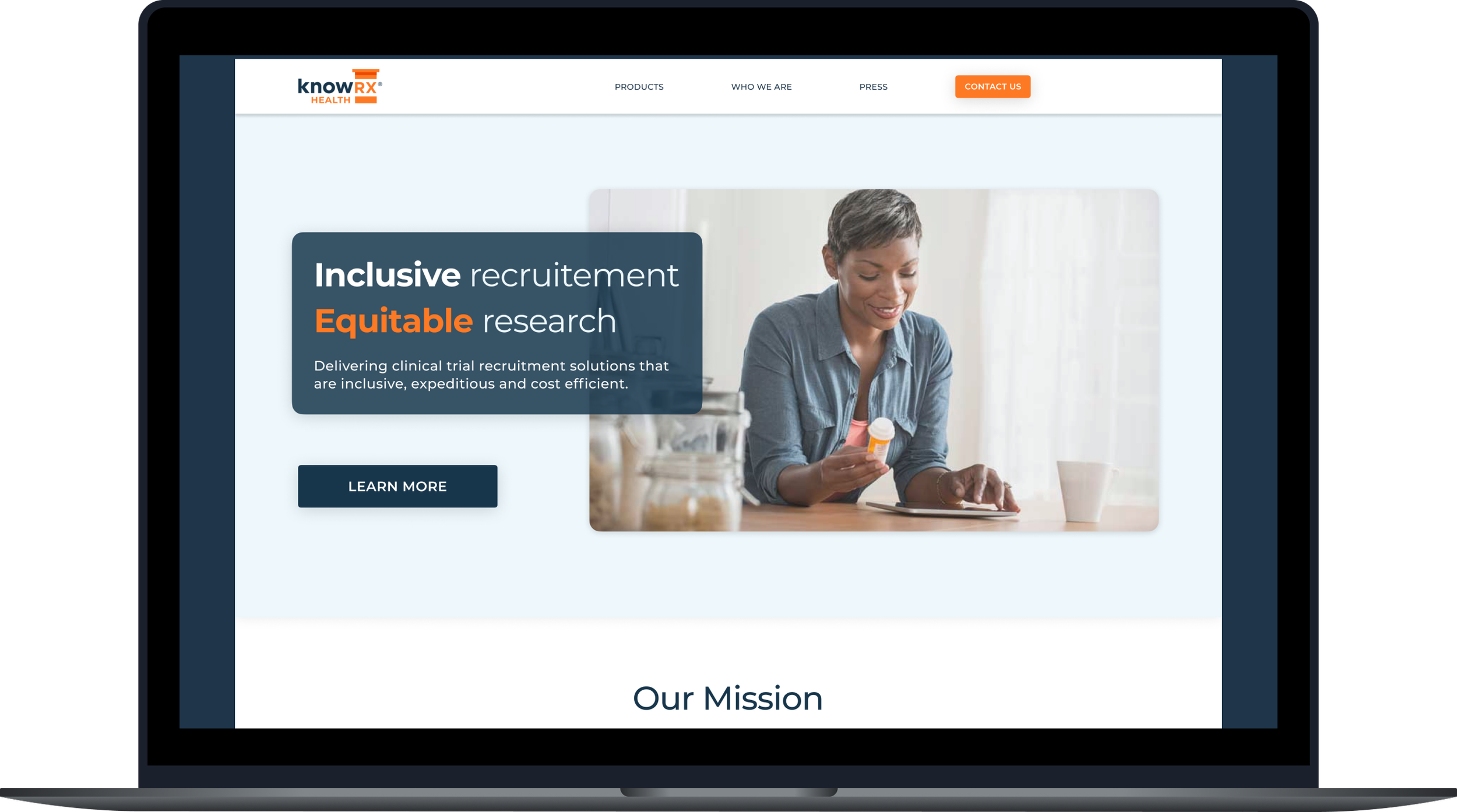
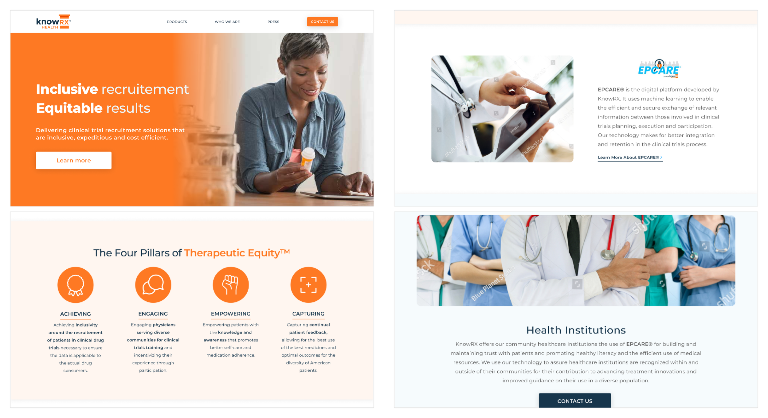
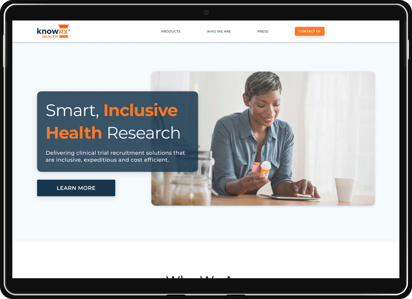
Like I stated previously, KnowRX needed a strong hero image above the fold to catch the user’s attention and humanize the brand. I started off with an image of a woman holding pills, a strong tagline and a clear call to action.
I kept “The Four Pillars of Therapeutic Equity” since those were values that were critical to the company brand. However, I visually aligned and emboldened key words to highlight the messaging.
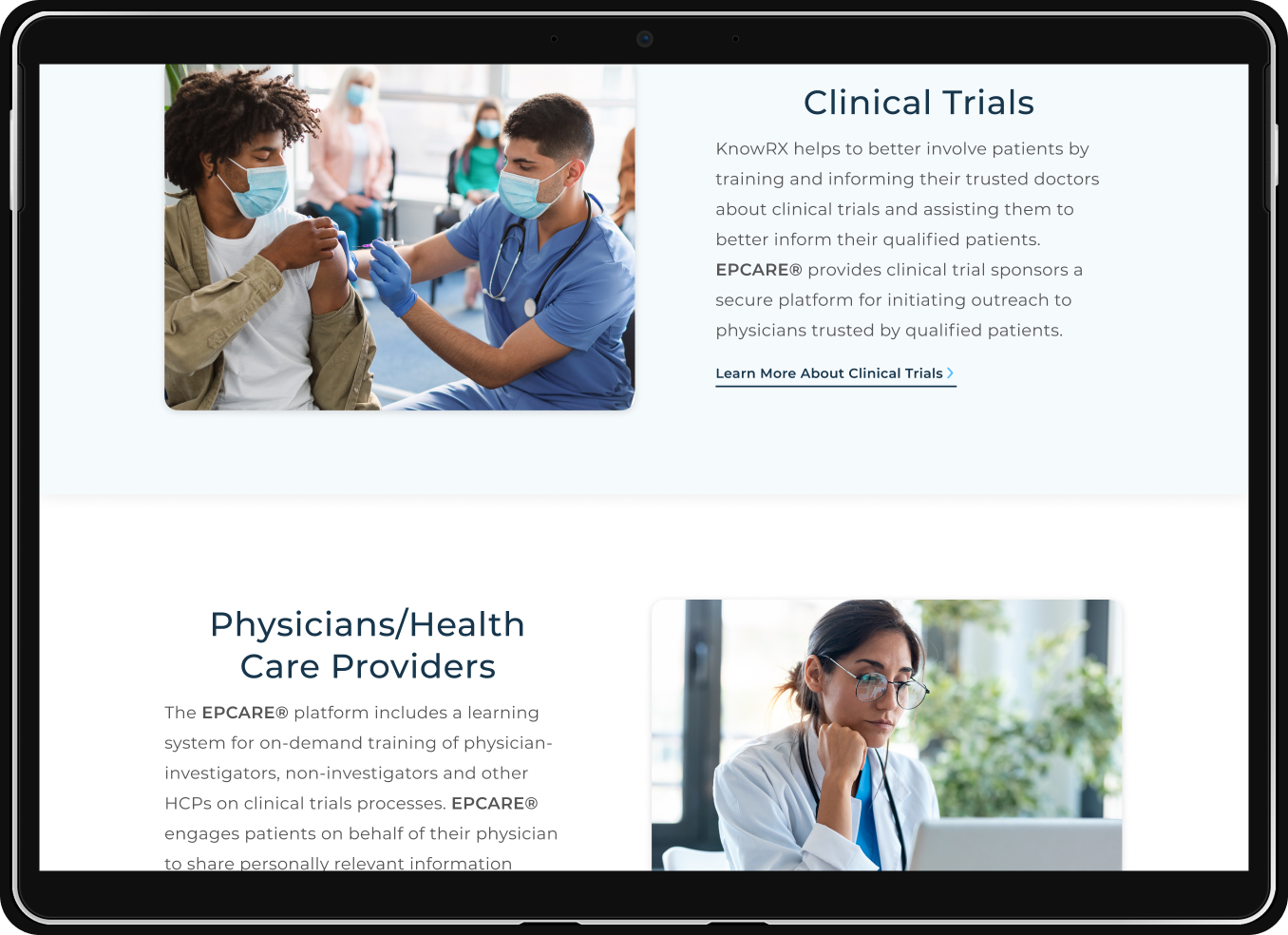
I broke down each topic and product visually with imagery, white space and messaging, adding in links to “learn more” and “contact us”. I highlighted “Epcare” with its own image of a doctor holding a tablet since that was a product that was meant for those specifically involved in clinical trials planning and execution.

First Iterations
Guerrilla Testing & Feedback
I needed some high level feedback in addition to that of the stakeholders and CEO so I did some informal testing of my own. Users were quick to point out the orange, stating that they usually associate blue with healthcare, not orange.
Furthermore, as a company who’s main focus is diversity and equity, why is there only one image of a black person and no diversity in the image with the healthcare workers? All great feedback.
Lastly, as a follow up to the orange in the opening banner I made sure to test for accessibility and surely, the white copy on orange was not accessible by WCAG standards, so back to the drawing board it was.
Final Designs
Hero
To start, I removed the orange as the primary color and went with the KnowRX blue which was better suited for a healthcare setting and provided sufficient contrast when paired with the accompanying whites.
The hero image above the fold was maintained and cleaned up along with the messaging and the “Learn More” CTA.
The supporting copy helps the user understand the types of services KnowRX provides.
Mission
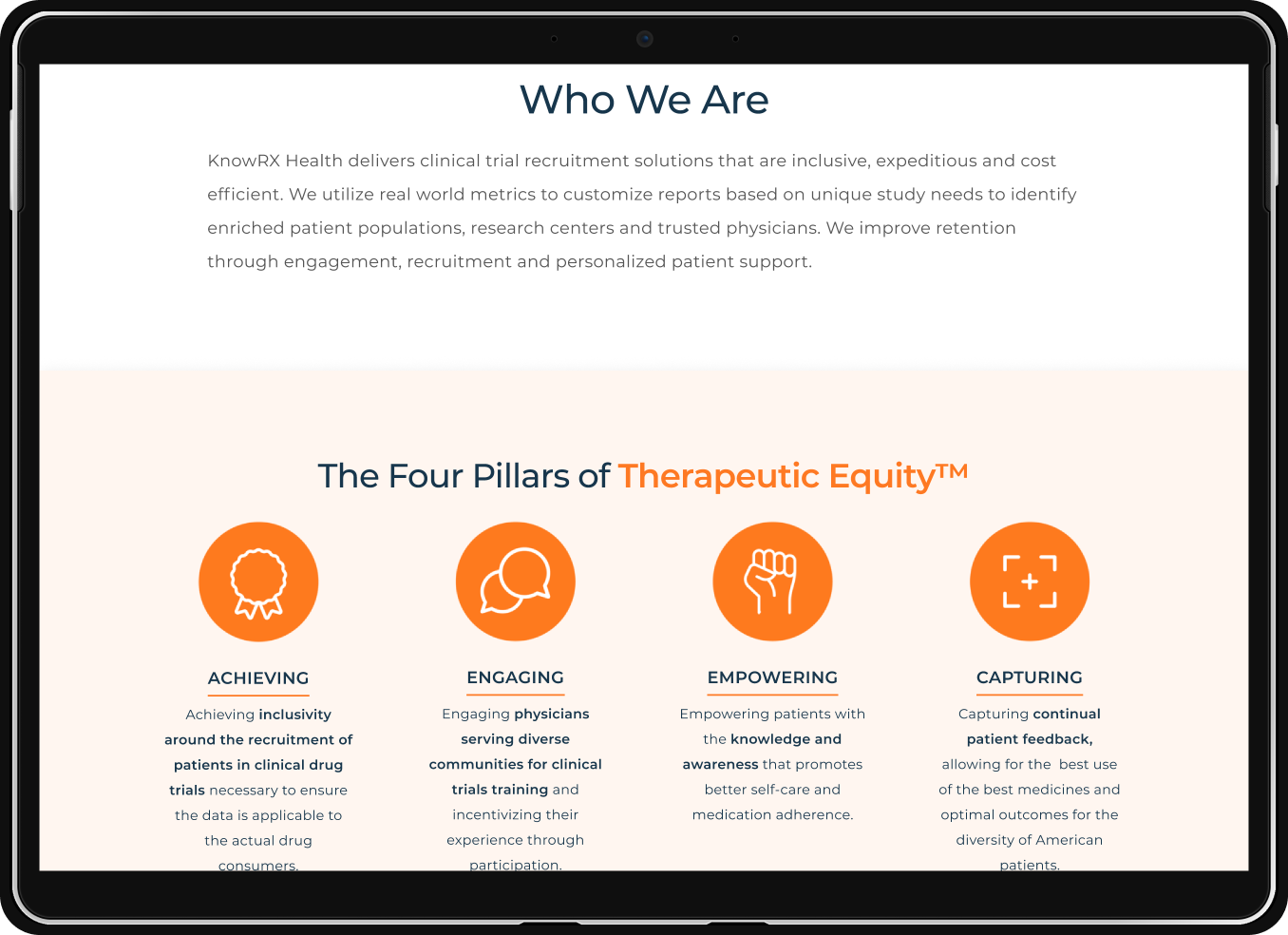
I Maintained the “Four Pillars of Therapeutic Equity” since these are the values that are crucial to the culture and mission of the company.
A “Who We Are” section was added for clarity, so the user would understand how they can benefit from the services of KnowRX.
Products
KnowRX had two product offerings at the time, a digital platform called EPCARE for healthcare providers and institutions as well as a medication management app for patients called The Owl App.
I wanted to ensure that the user had the ability to learn more about each of these and how they relate to KnowRX as a whole.
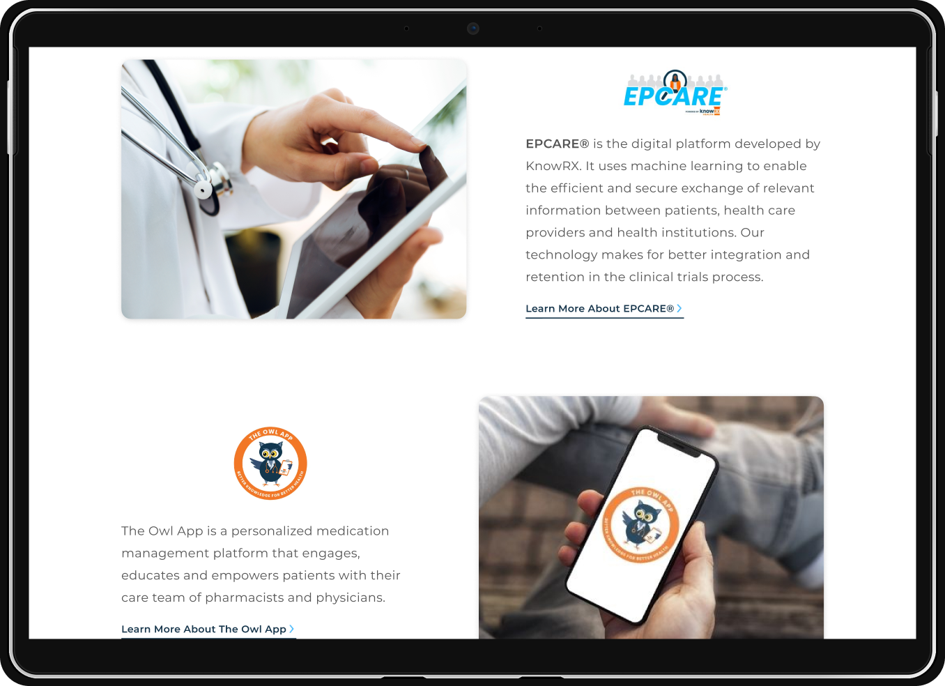
Epcare®
Once the user decides to “Learn More About Epcare”, they are taken to the EPCARE page where they are provided the necessary information to understand how the product is able to facilitate, retain and engage patients as well as doctors involved in clinical trials.

Imagery
Brand right imagery was key in communicating diversity and equity in patients participating in clinical trials as well as representation in a diverse population of doctors and healthcare providers who drive these trials.
It was of utmost importance that the user understand the relevance of inclusion in clinical trials and why it is so important and makes for better medications and over all cost effectiveness.