Ride On Cycling: Discover the perfect ride for your next great adventure.
The e-Commerce site for the active cyclist, designed for mobile responsiveness and optimized for the browsing and check out experience.
Background
RideOn Cycling was a bike company selling goods on their web platform. Catering to serious cyclists, they needed to enhance their mobile browsing and checkout experience to greatly improve their product’s usability and conversion.
I was the sole designer and was responsible for research, ideation, design, prototyping as well as user testing and iterations.
The Problem
Data confirmed that 50% of users open on average 7 item pages and then abandoned the site without moving any items into their cart. The hypothesis was that users were unable to determine which bike was best based on relative features.
Additionally, 70% of users who placed an item in their cart did not follow through with the purchase. Furthermore, data showed that users abandoned their cart at the registration page. At the time, users needed to create an account to make a purchase.
The Solution
I designed a solution that would appeal to the user as an informed buyer, well equipped to compare features on several products and then increase conversion by facilitating the purchase with the ease of a guest checkout.
Target Audience
The target user for this platform consists of 72% men between the ages of 24 - 38. These users are high income earners; serious cyclists who do their research and are willing to spend a pretty penny on their investment. They want to know everything there is to know about their purchase.
Discovery
Considering the fact that I haven’t ridden a bicycle since I was 15 years old, and knew even less about the types of bikes avid riders might be interested in, I decided that the discovery phase was probably the most important part of the project. I started with some competitive analysis.
Competative Analysis
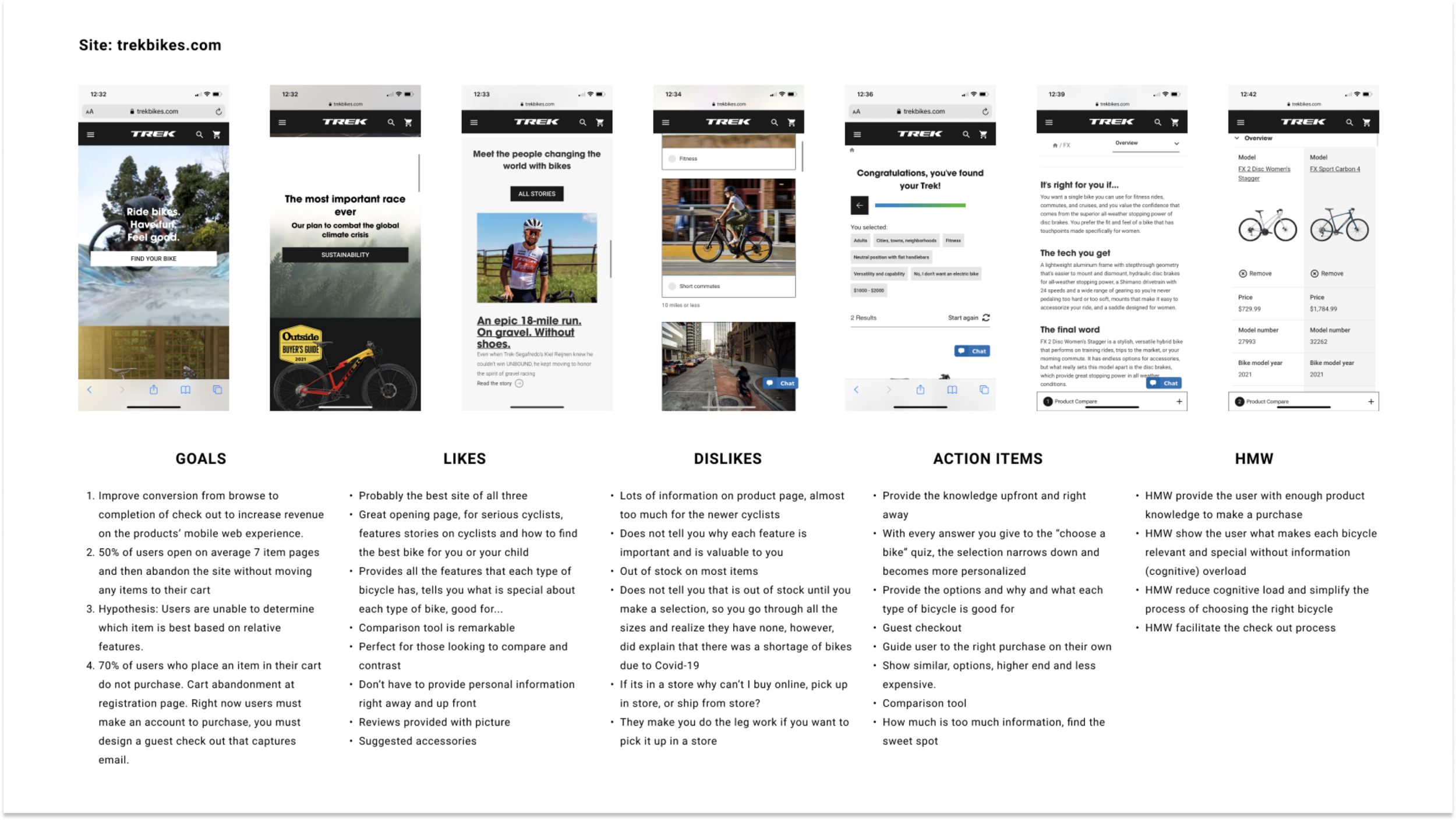
Trekbikes.com
Trek was probably the best cycling site I encountered. The imagery and price point was clearly catered to the serious cyclist. I found the comparison tool as potentially beneficial to users. However, the use of excessive bike terminology without explanation might deter those who may be interested but not expert enough to know what everything means.
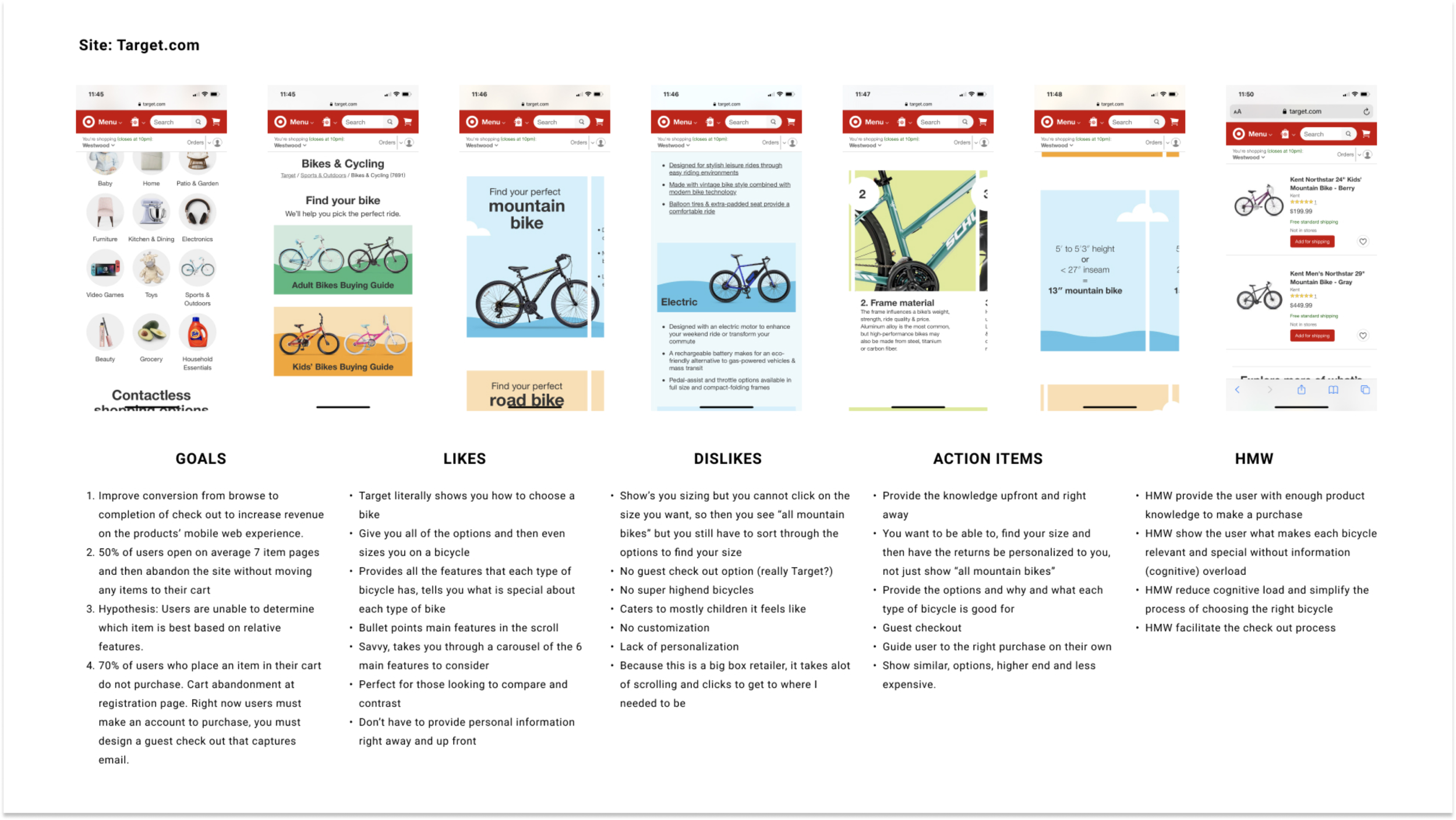
Target.com
Target quite literally shows you how to choose a proper bicycle, it displays all the features and components and explains them in layman’s terms, perfect for the beginner cyclist. However, the price point was a bit low for the more avid cyclist, mostly catering to children and less specialized bikes. Lastly, they did not offer a guest check out, which was surprising to me.
Although, very different, these sites offered some great insight. I loved the seriousness, branding and guest checkout of Trek bikes but I was able to better understand bike terminology and features with the Target site. I hypothesized that simplified terminology along with a comparison tool would help with site abandonment and gain potential market share with those more intermediate riders.
Survey Screener & Interviews

I received 18 responses of which I screened further to conduct 4 interviews of some novice as well as more advanced cyclists.
Key Topics & Insights
I learned so much from my conversations with cyclists. I was schooled on everything, from bike varieties to specifics on components, terrains, gear and even the cycling community. With affinity mapping, I was able to streamline the information and find some clarity.

Personas
From the informational interviews and derived insights, I gained a better understanding of the types of riders and their cycling needs. I created two personas; one for the more advanced and one for the intermediate rider.
The Advanced Cyclist:
Jack is the advanced cyclist. He wants a no hassle shopping experience, knows what he wants so he expects to be presented with relevant viable options.
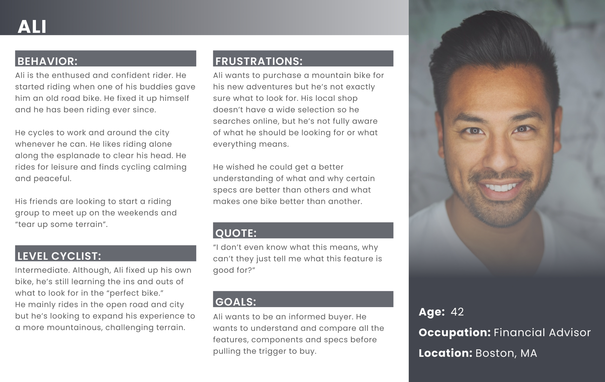
The Intermediate Cyclist:
Ali is the intermediate cyclist. He is shopping for a second bike to expand his riding. He requires a little more guidance as to choosing the best bike for his needs.

Design & Ideate
Based on my learnings in the discovery phase, I generated some user stories to get a feel for the types of goals and tasks users were trying to accomplish.

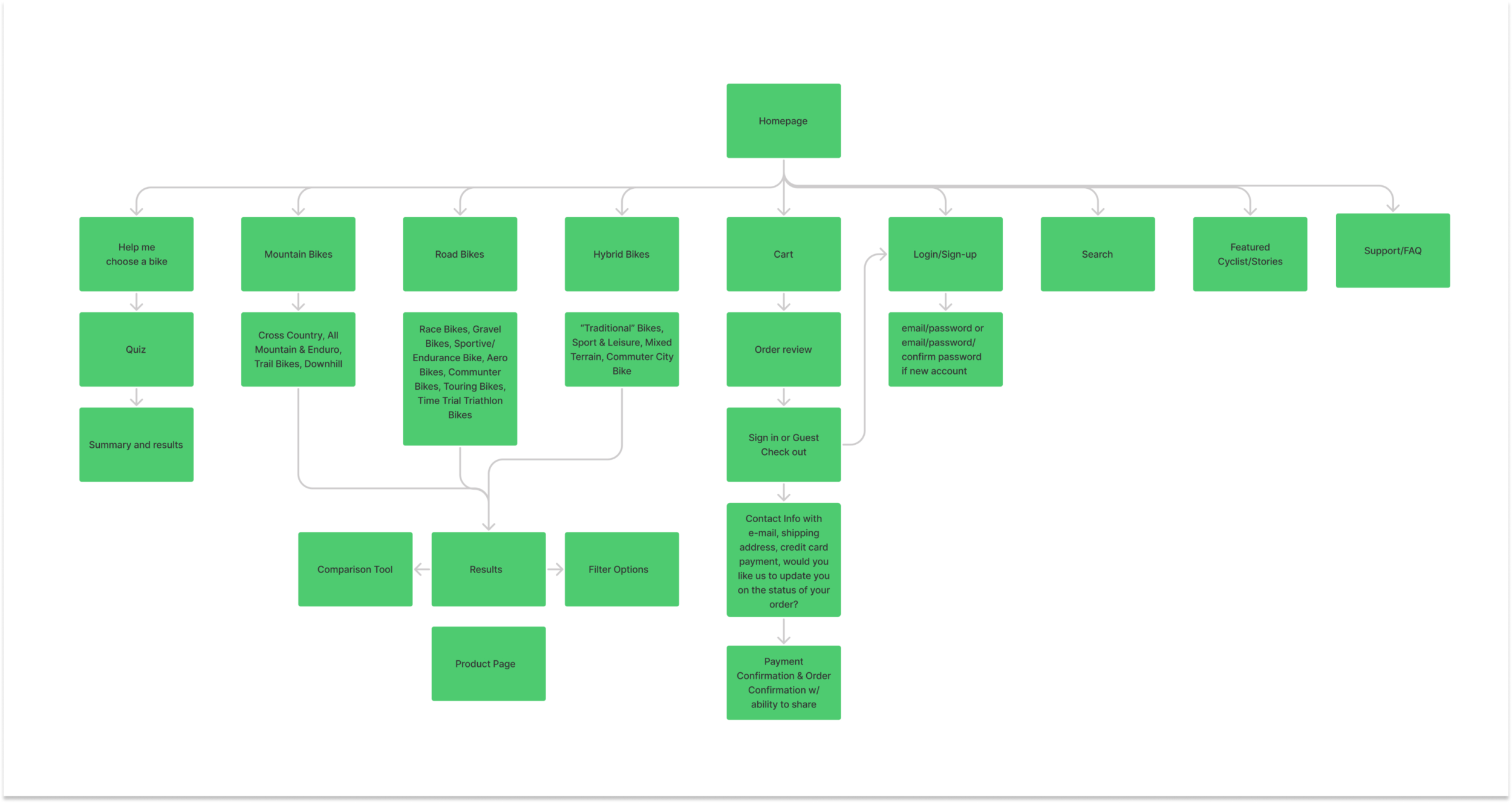
Architecture
I then used FigJam to build a sitemap of my platform and organize the needs and wants of users. I made sure to include features such as a guest checkout, a comparison tool, a categorized bike search as well as a bike quiz tool to help the more novice cyclists find “their perfect bike.”
User Flows
Red Routes:
Bike Search
Guest Checkout
Comparison

Sketches
I knew the platform had to be a mobile web adaptation of the desktop version so I got to sketching my red routes. I identified key CTA’s and the basic layouts of my screens. These quick sketches gave the the skeleton I needed to move forward.

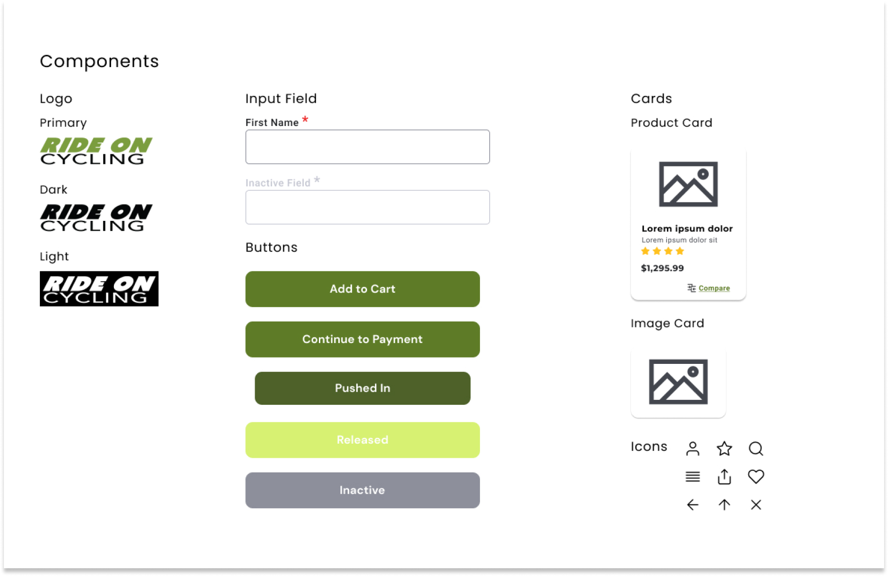
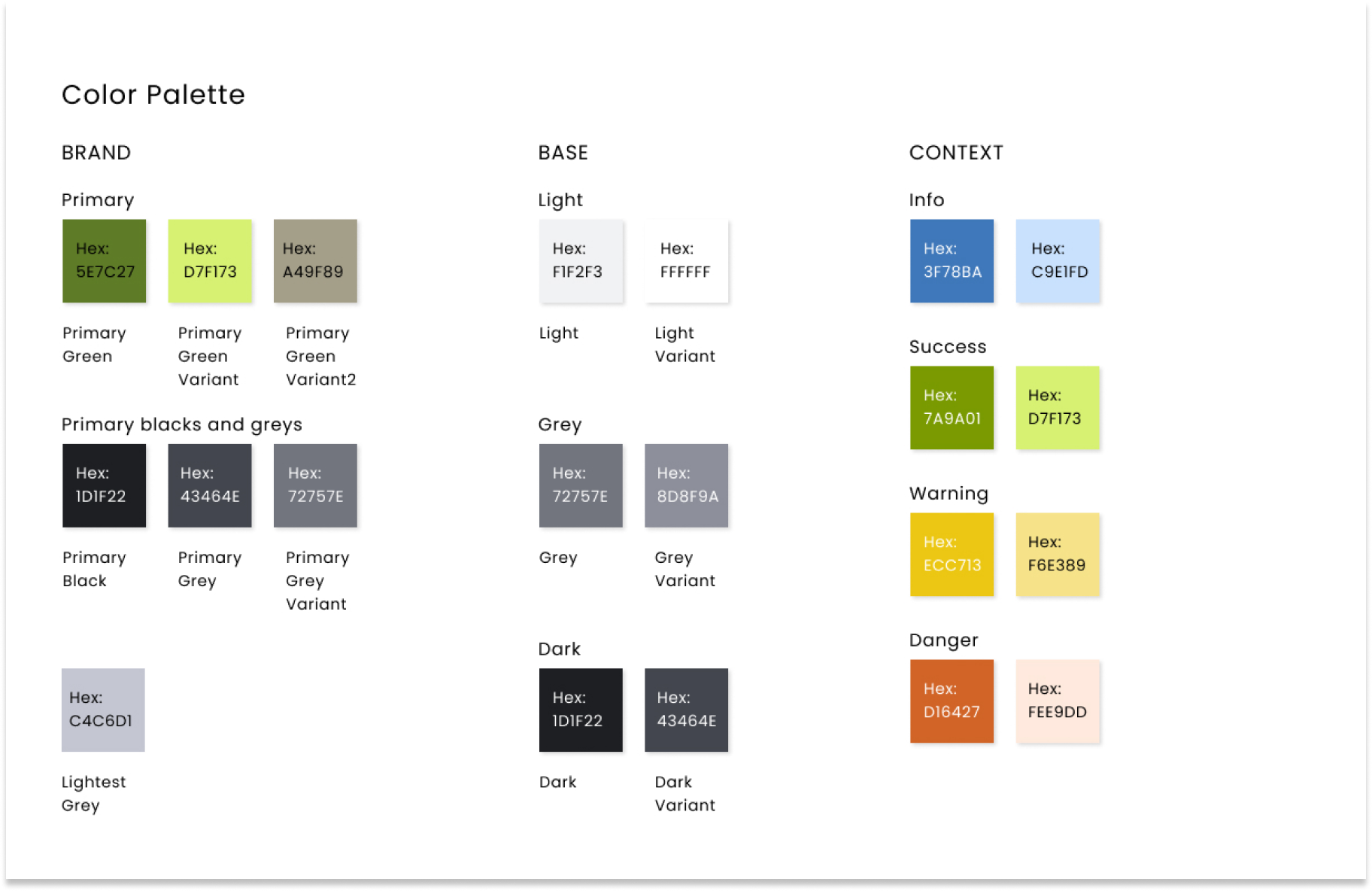
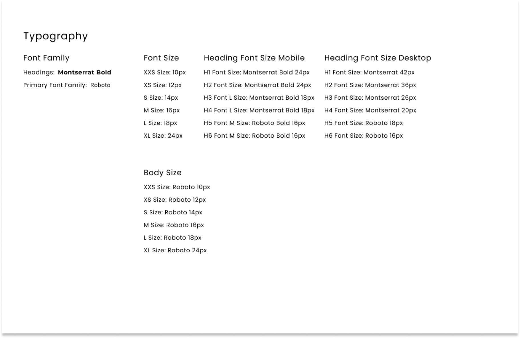
Style Guide
I also developed a style guide to maintain consistency in design and branding; defining brand colors, UI components and typography.
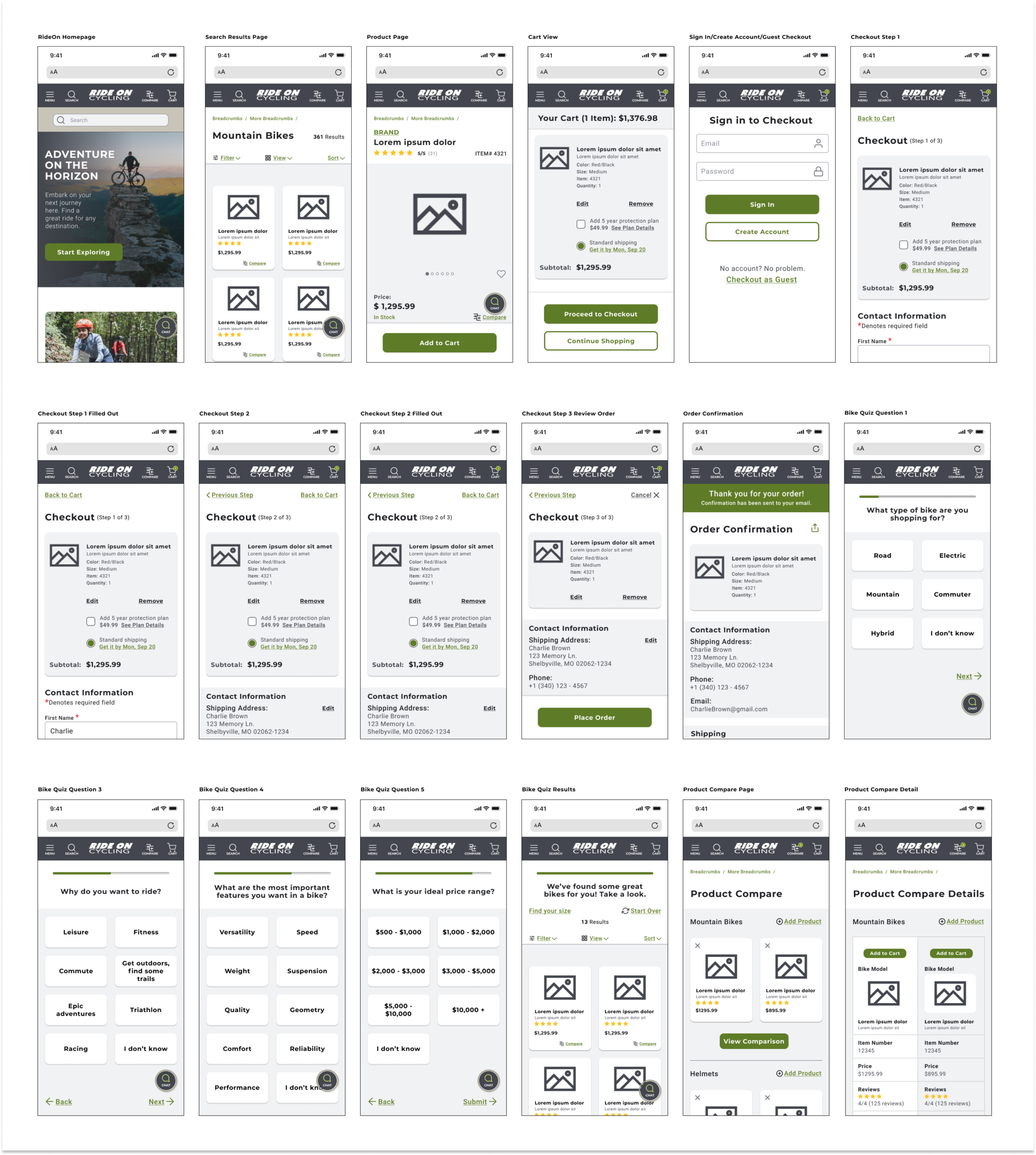
Wireframes
The wireframing process is where everything started to fall into place and take form. My initial sketches were great but not ideal for user testing, so I jumped on Figma and got busy framing.
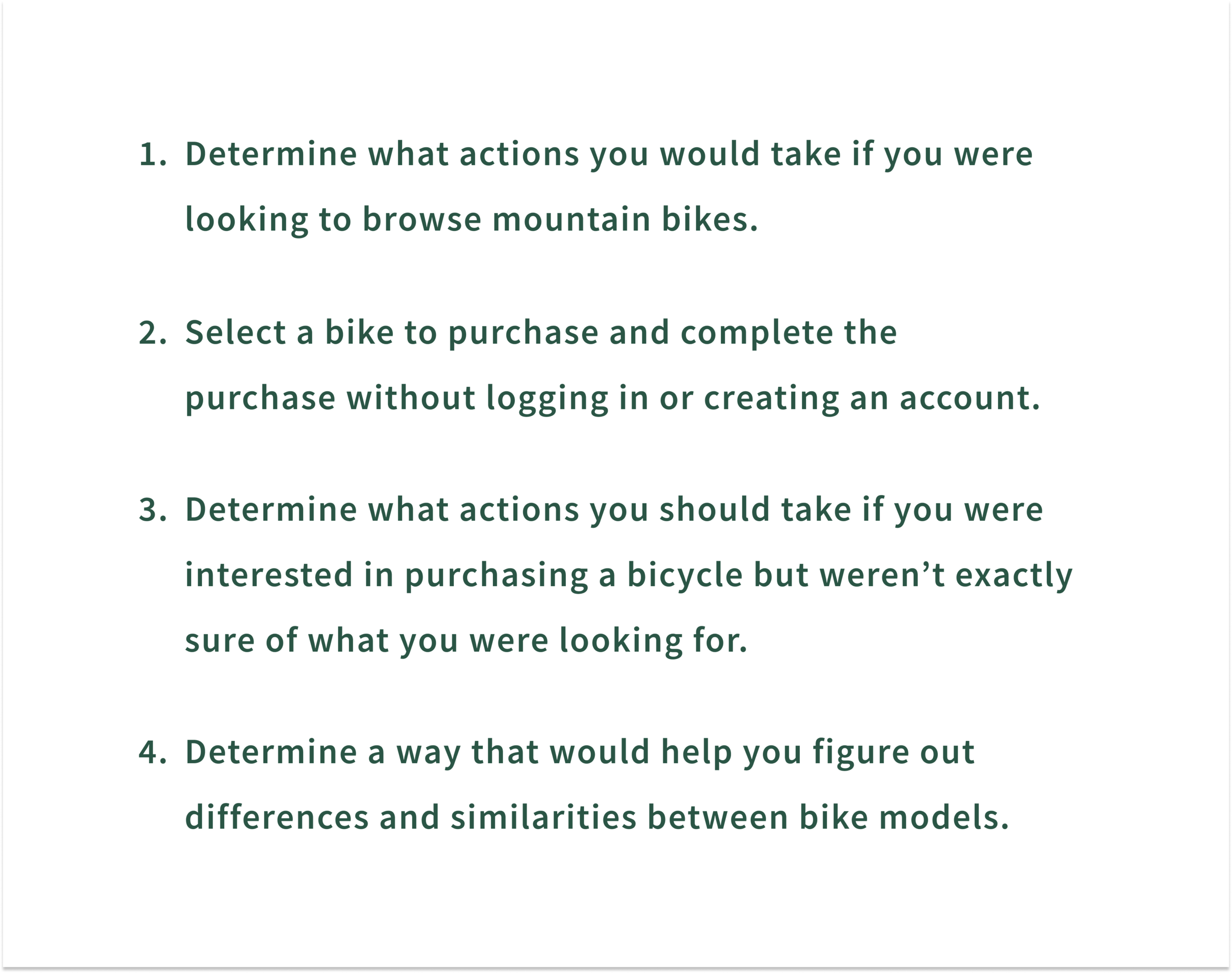
User Testing
For the first round of user testing I recruited 5 users who were well versed in online shopping as well as cycling. They were given 4 tasks to perform.
Findings & Feedback
All participants were able to complete each task on their own with minimal friction. What I found was even though I tested wireframes, users still expected a fully functioning experience.
For example, the hamburger menu was not active for the wireframe prototype, and just about every participant went to the hamburger menu in search of shopping categories to navigate their way around, despite the search bar and navigation across the top.
Feedback Round 1
The hamburger menu is usually the easiest and most direct way to access categories or pages, it was not active.
The compare option did not allow users to add more than one bike.
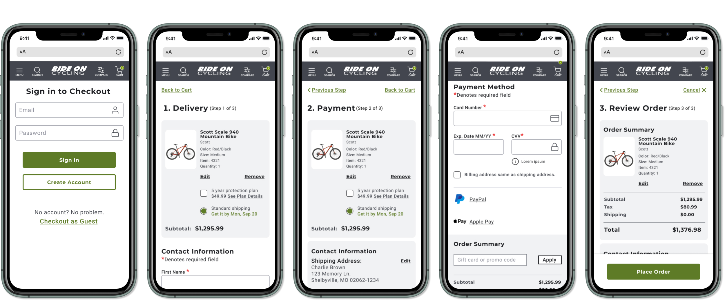
More clarity needed in the multi-step checkout process. Users need to understand where they are in the process of checking out.
I iterated on the wireframes, adding in imagery and changes based on the first round of testing and then tested again. This time with 4 users. Users expressed their delight with the homepage hero and a compelling call to action right away.
They were given the same tasks to complete. Once again, I received some great feedback that I was able to implement into my final designs.
Feedback Round 2
Links were inconsistent, choose one style and color for all links.
Users wanted relevant “suggested items.”
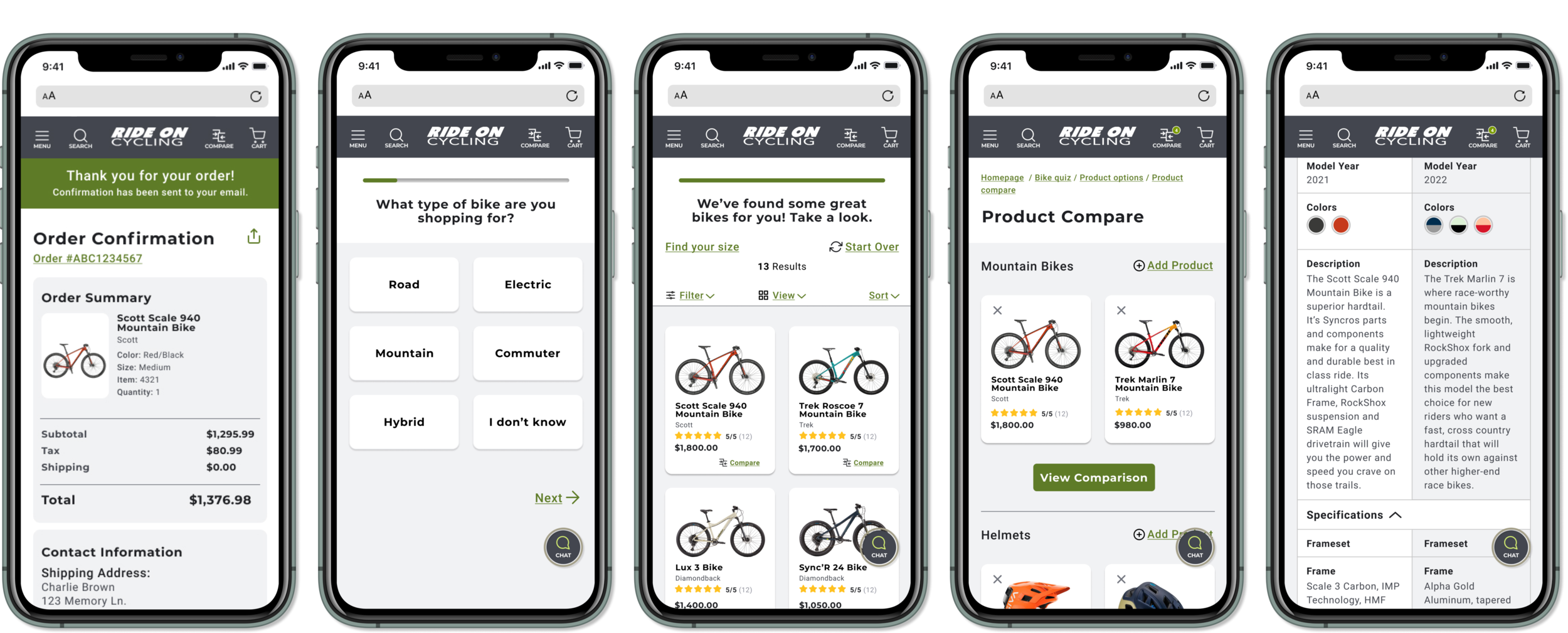
Usually, at the end of a completed checkout, users get a confirmation with a “confirmation number.” There was no confirmation number on the confirmation page.
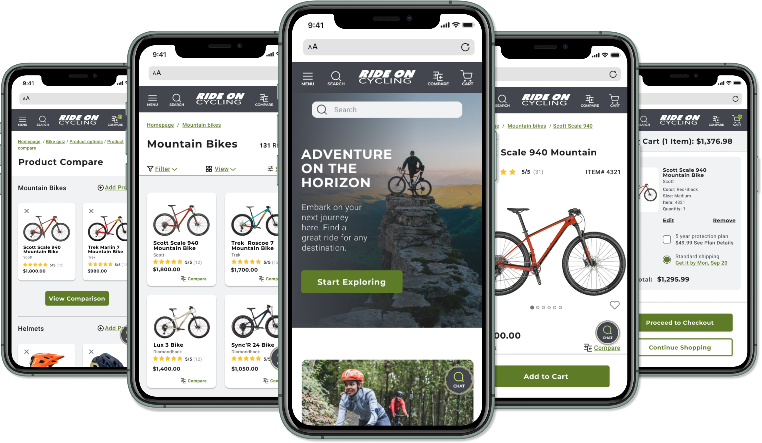
Final Designs
The final designs include the relevant changes made from user testing, such as link consistency, added confirmation detail, progress clarity around the checkout process and more.
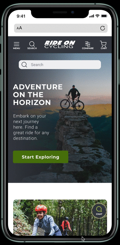
Homepage
The homepage features a top navigation bar, which is consistent with most other e-Commerce mobile web sites, a hero image with compelling copy to initiate a call to action, a bike quiz for those who are unsure of what they are looking for, and a fixed “Chat” icon for additional assistance.
Users are able to explore products by either searching in the search bar, scrolling for ideas or clicking on the hamburger menu for more category options; which we learned in early user testing is key to direct navigation.
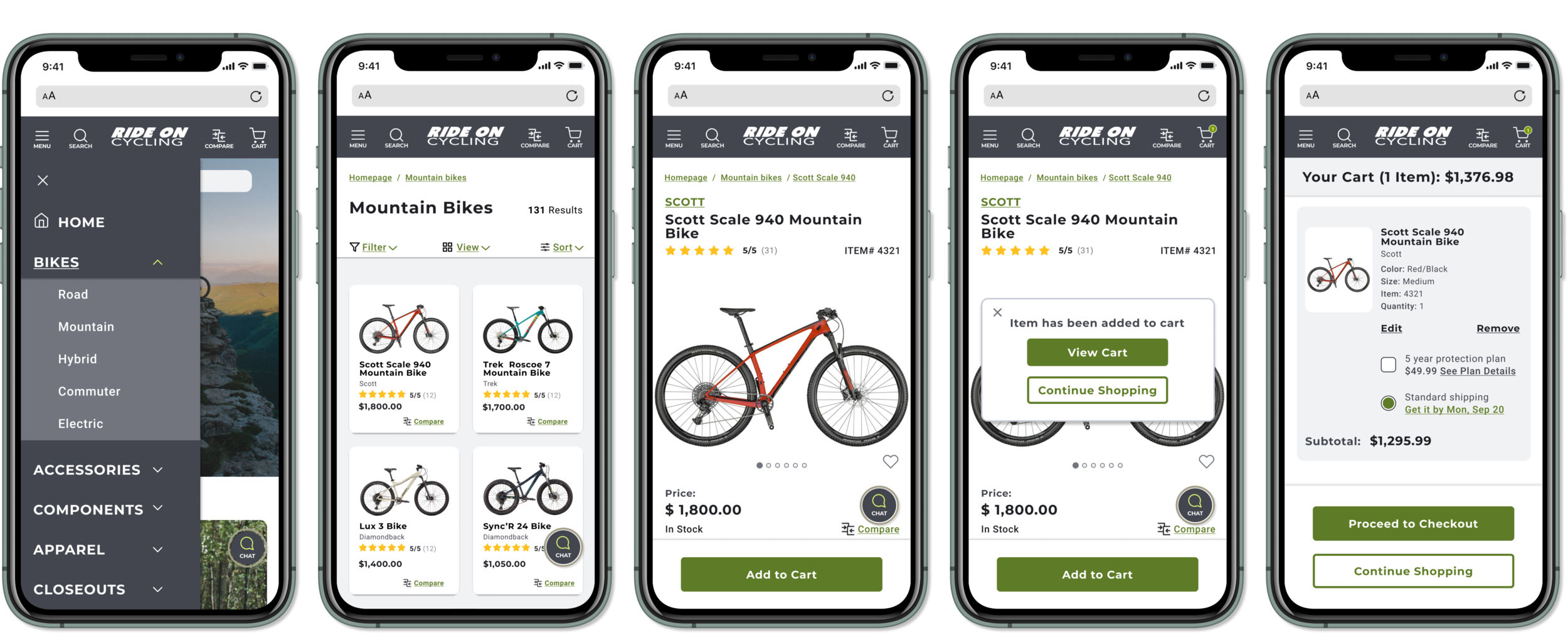
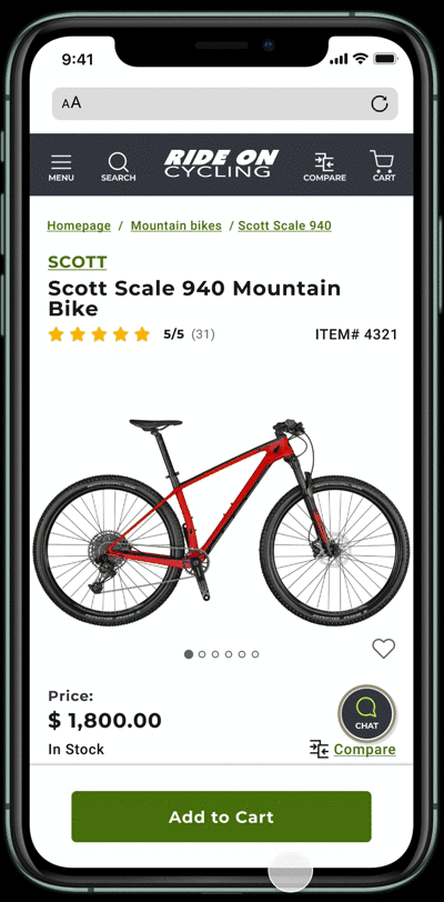
Product Detail Page
The product page offers all the necessary e-Commerce must haves; images, availability, sizing and colors. I included a carousel of the bike’s most relevant features and why they are important, with simplified verbiage that is easy to understand.
Also featured, are all the imperative specs for those looking for specific component details as well as relevant suggested items. I added these in after usability testing revealed that users were also browsing accessories as potential add-on items.
Product Compare
The product comparison tool is a helpful feature that can be used by the most novice to the most advanced cyclist.
Detailing products’ price, specs, components, geometry, drivetrain, wheels, frame, handlebars, etc., in a side by side item view.

Learnings
Overall, users were extremely satisfied and appreciated the design’s intuitive flow. On more than one occasion participants stated “how easy” it was to complete the tasks and “how cool” it was to see item comparisons side by side.
Also, users acknowledged and praised the provided payment options, stating that sometimes when paying as guests, they prefer to pay with a third party like Apple Pay or PayPal.
“If I’m not going to create an account, then I usually don’t want to put in my credit card information either.”
Lastly, the delicate mix of bike jargon with simplified explanations made for users’ better understanding of features and value. For example, understanding why a carbon frame is superior to an aluminum frame and how that would translate to the overall cost.
Final Thoughts
I found this project particularly challenging and out of my comfort zone which was in many ways eye opening and made for a great learning experience.
Aside from my basic understanding of e-Commerce, I quickly realized I knew little to nothing about the topic at hand. I gained a great appreciation for user research as well as competative analysis when it comes to optimizing an e-Commerce platform.
I now have a better grasp of the efficiency and intuitiveness of a good retail site. Regardless of products, I learned some best practices that can be applied to any future e-Commerce projects to sell just about anything.