Simplify your life with the subscription laundry service created for folks on the go: !-Lave case study
The pick up and delivery service dedicated to fulfilling your laundry needs locally and at your convenience. Designed with busy lifestyles in mind, !-Lave addresses your laundry and dry-cleaning demands in an effortless, easy to use way.
Background
!-Lave was presented as a central platform to connect customers to drivers and local laundromats. The goals were to drum up activity for local businesses, keep existing drivers working and create an easy to use local laundry service for anyone on the go.
My role was originally as sole UX/UI designer on the project. Over the course of 3 months, I was to research, ideate, design, test and iterate on existing screens, as well as fill in any gaps in flow or design.
However, when I presented the Heuristic analysis of the customer and driver flows, I was asked to take the lead to brief and communicate key areas of focus as they brought on another team to work on critical needs on the drivers’ side. I maintained my focus on the customer flow.
The Problem
Essentially three apps in one, it was crucial that I find a way to integrate the flows, while also introducing new users to the app and all its functionality. Additionally, as a subscription based platform, I needed to create a means to collect all the necessary information from the user in order for them to be able to place their first order. The customer and driver flows were lacking critical on boarding screens in terms of new user registration and general on boarding.
The Solution
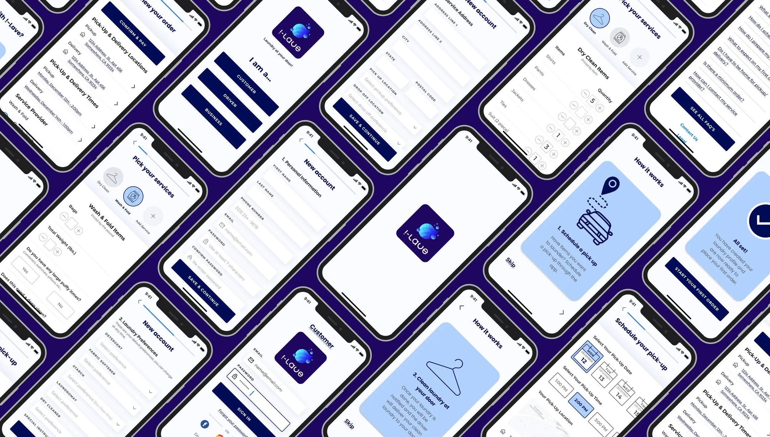
I designed a solution on the existing customer and driver mobile app platform. I created the initial app onboarding screens for the driver and customer sides to introduce and communicate app functionality.
Additionally, I added a “create account” route to the customer flow which allows first time users to sign up for services. Lastly, after user testing, I iterated on the original screens to allow for appropriate feedback, while also addressing key usability issues.
Target Audience
!-Lave is is a multi-functional app with the potential to serve customers, drivers and business owners. However, the particular area I worked on, the customer flow, was designed with busy folks in mind. From the single, career minded professional to the working parent who just can’t find the time.
Understanding The Problem
It was necessary that I got a better understanding of problem first. Being such a large build, and initially, the sole designer on the project, I started with some competitive analysis of the two mobile app flows, the driver and customer.
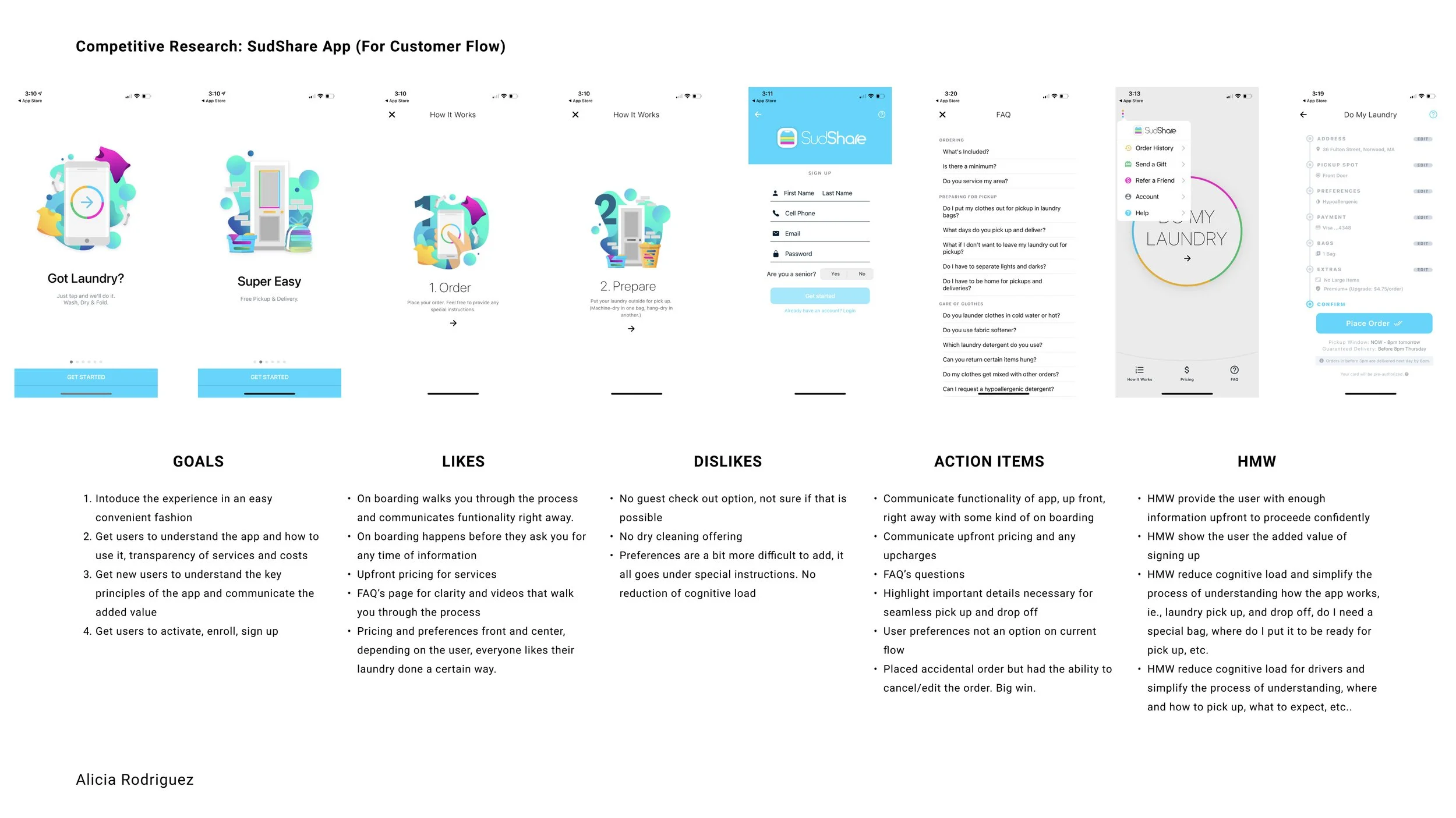
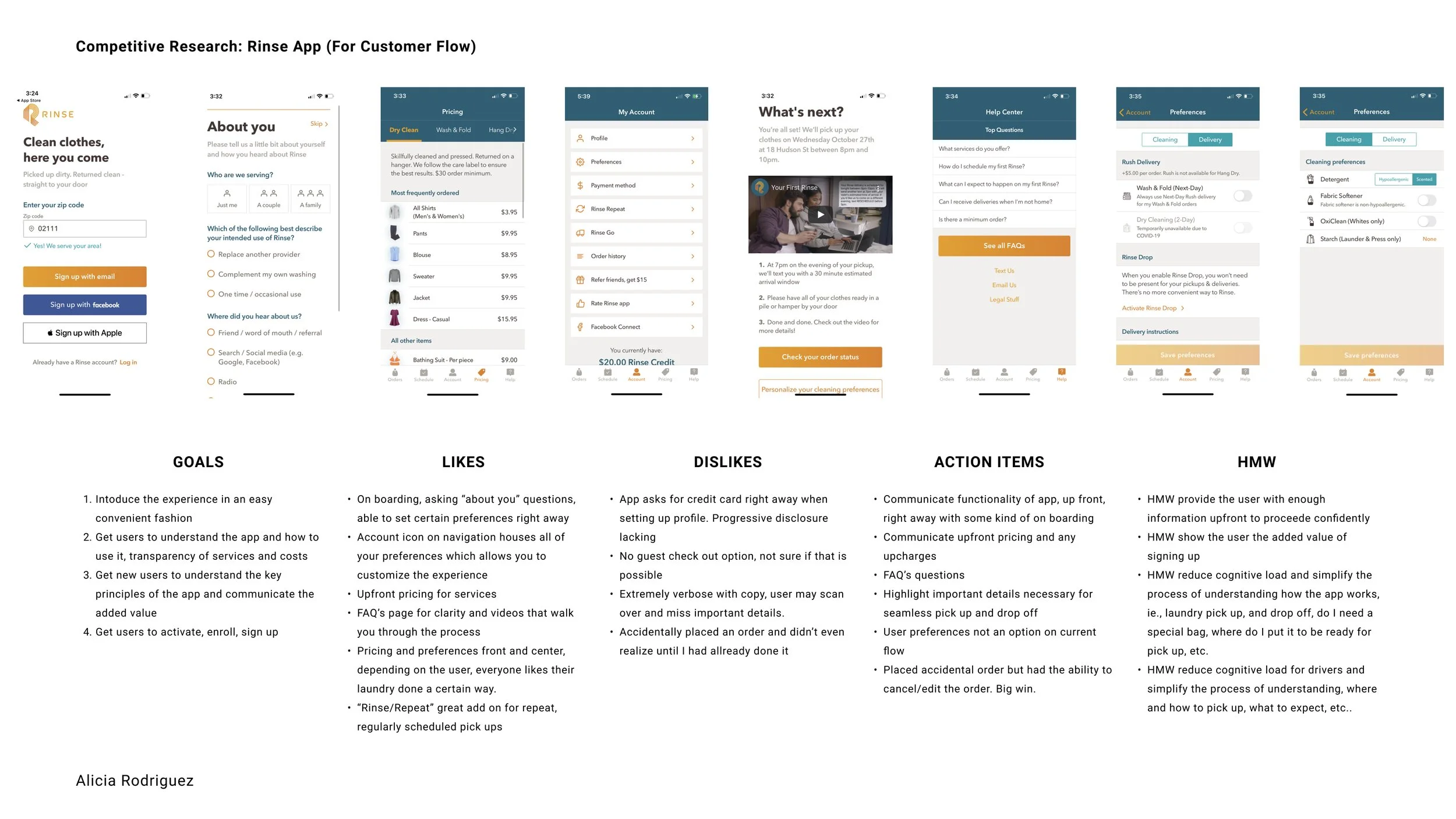
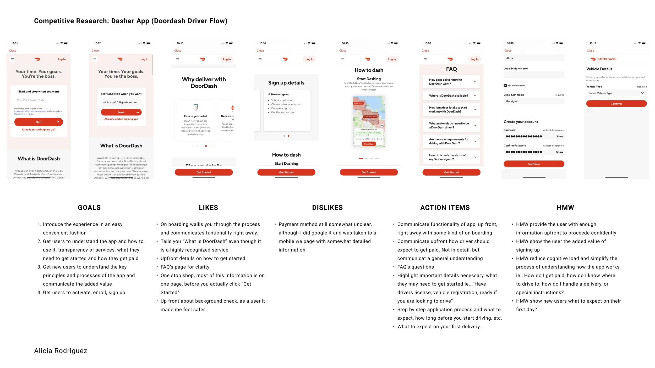
Competitive Analysis
CUSTOMER:
For the customer flow, I looked to existing laundry apps such as “Sudshare” and “Rinse”. Both communicated clearly, their process and functionality right away. They included upfront pricing for their services and featured FAQ’s pages and resources to address any confusion the user might have when using the app for the first time.
Additionally, they carved a clear path for the new user looking to create an account, set their preferences and place their first order. These routes were missing in the current iteration of !-Lave.
DRIVER:
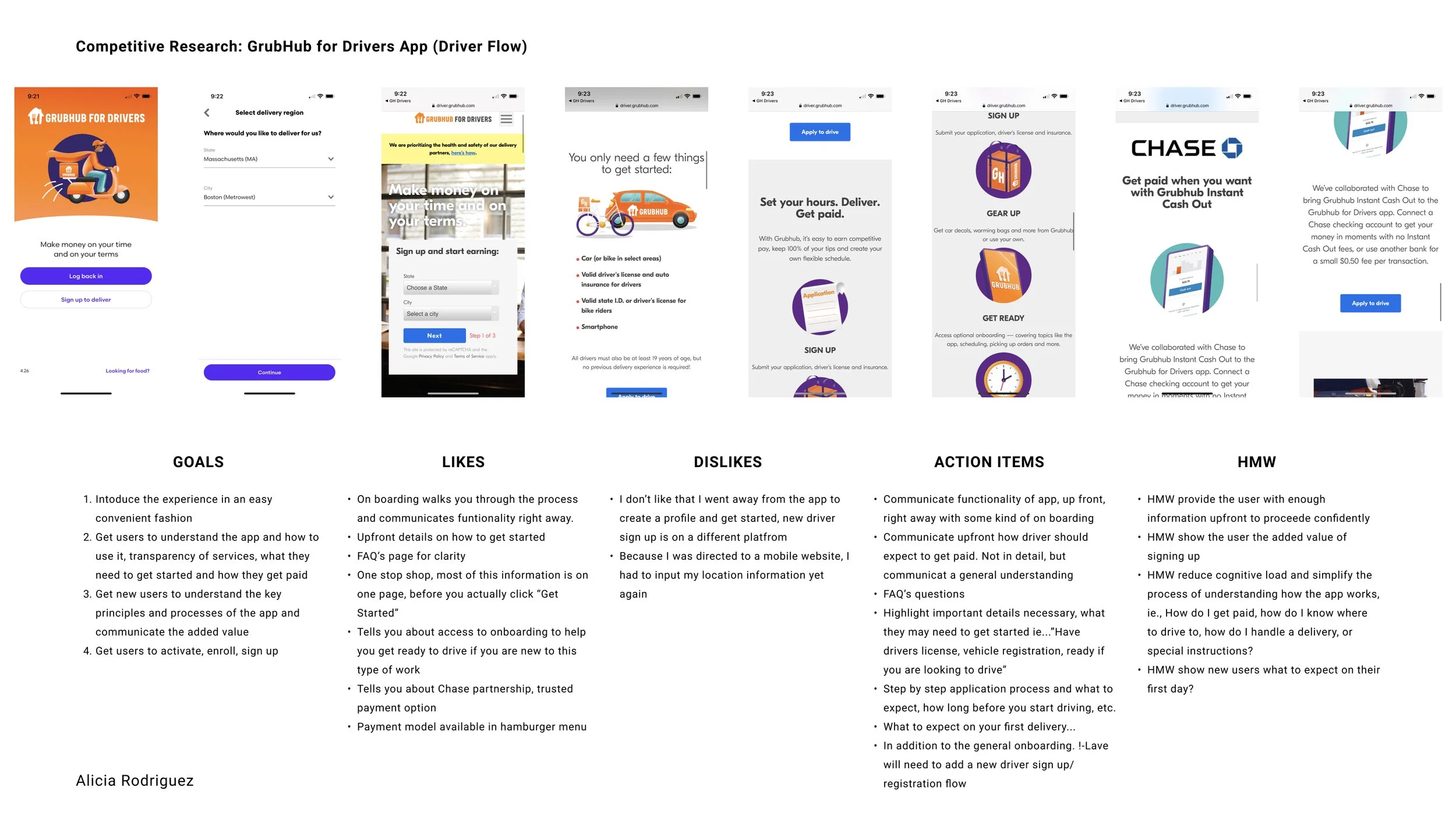
For the driver’s side, I looked to “Dasher” (Doordash driving app) and “Grubhub for Drivers” . Once again, both provided clear communication as to their process and functionality right away.
They also included several informational pages as to how to start driving, what you need to get started and even how a driver can expect to get paid.
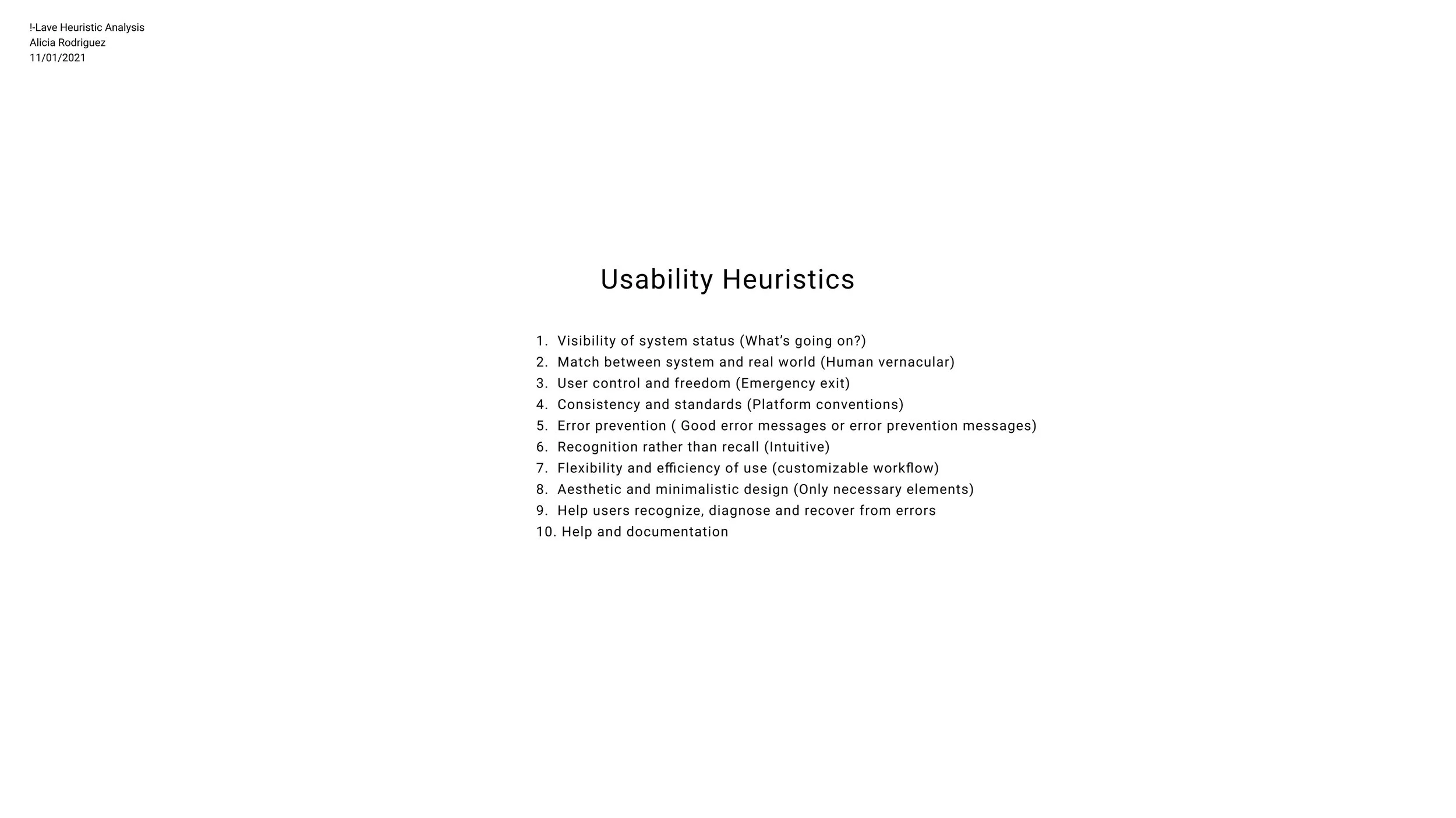
Heuristic Analysis
I now had a better sense of the white space and where I needed to focus my attention. However, whatever I created needed to be a piece of the whole and fit into the current design. I did a Heuristic analysis of the current customer and driver flows to further my discovery.
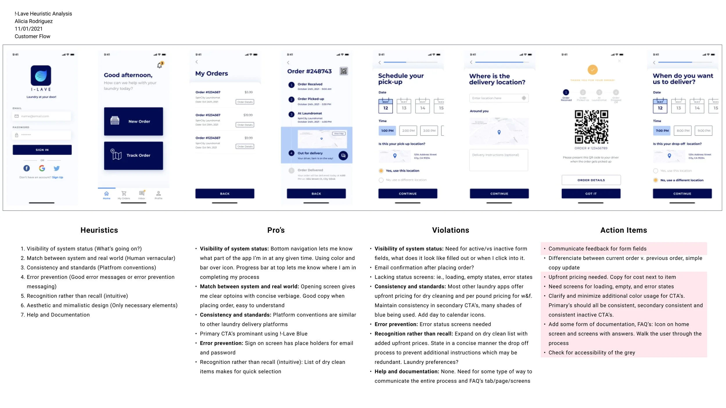
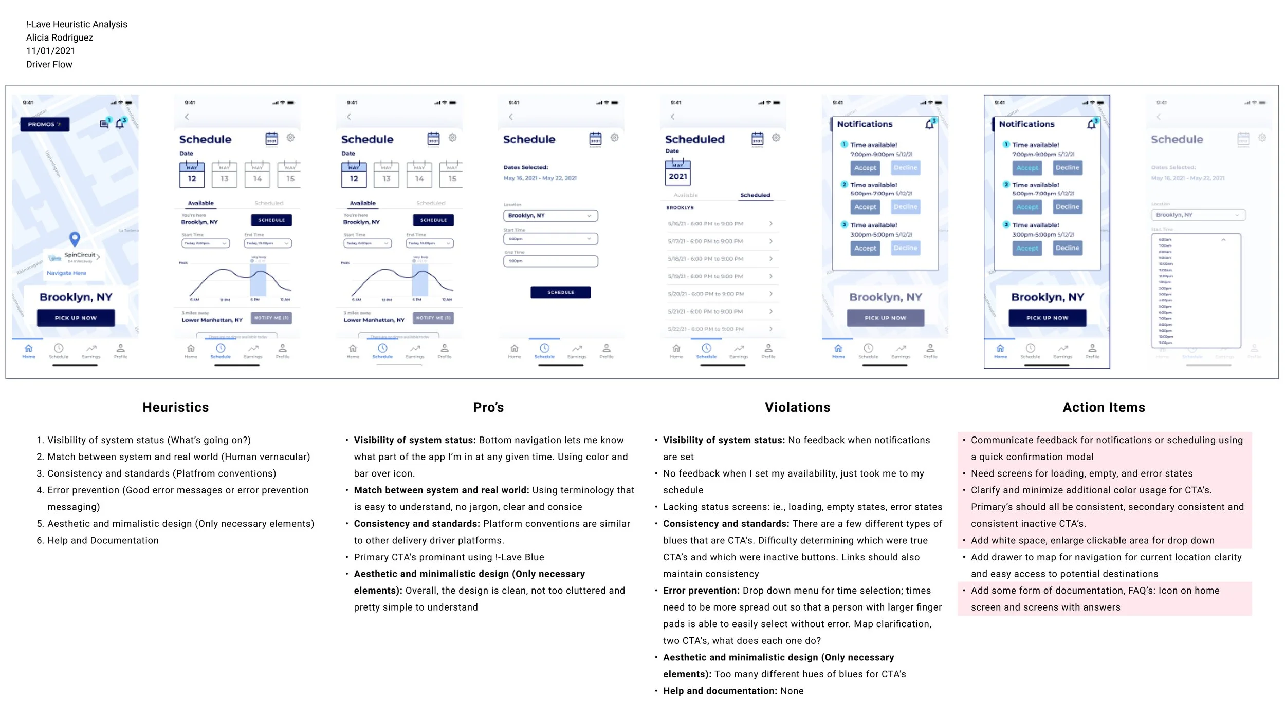
Action Items
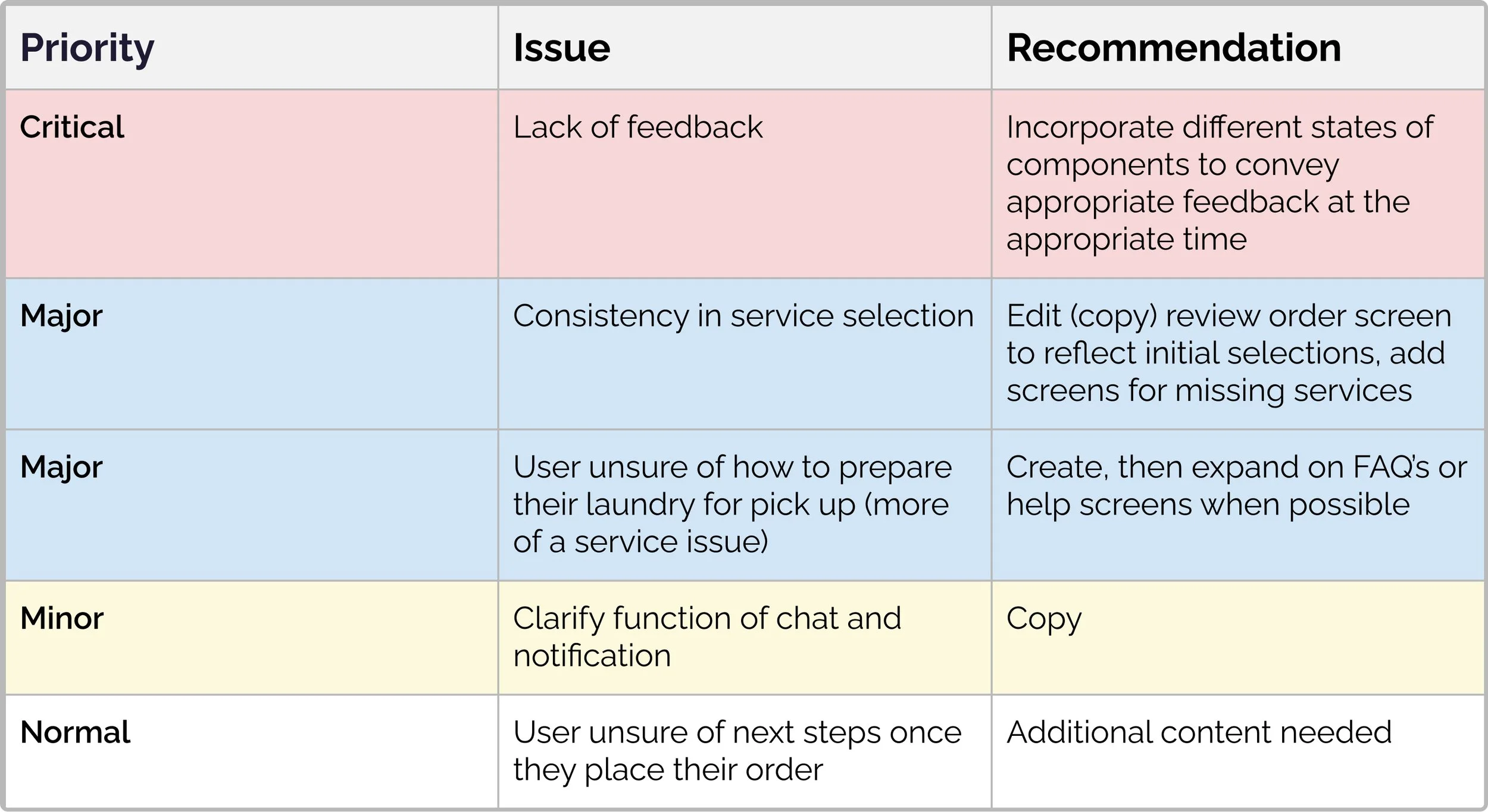
Heuristic analysis revealed some usability violations with the current design. Realizing the scope of the work and a tight timeline I chose to focus on the major issues on the customer side. I made sure to communicate the driver side findings to the incoming team of designers as it was requested from the client that they work through that portion of the build.
Need for feedback on components and selection screens
Create consistency in CTA’s, inability to differentiate between certain texts and CTA’s
Need for documentation, “FAQ’s” or “Help”
Accessibility as far as the grey used for text was non-compliant by WCAG standards
Key Insights
Users need to be introduced to a new experience in an easy convenient fashion.
The app needs to communicate the key principles of functionality and its perceived added value to the user right away.
New users need the ability to create an account and save certain preferences.
Users require an understanding of system status as well as consistency of standards and calls to action.
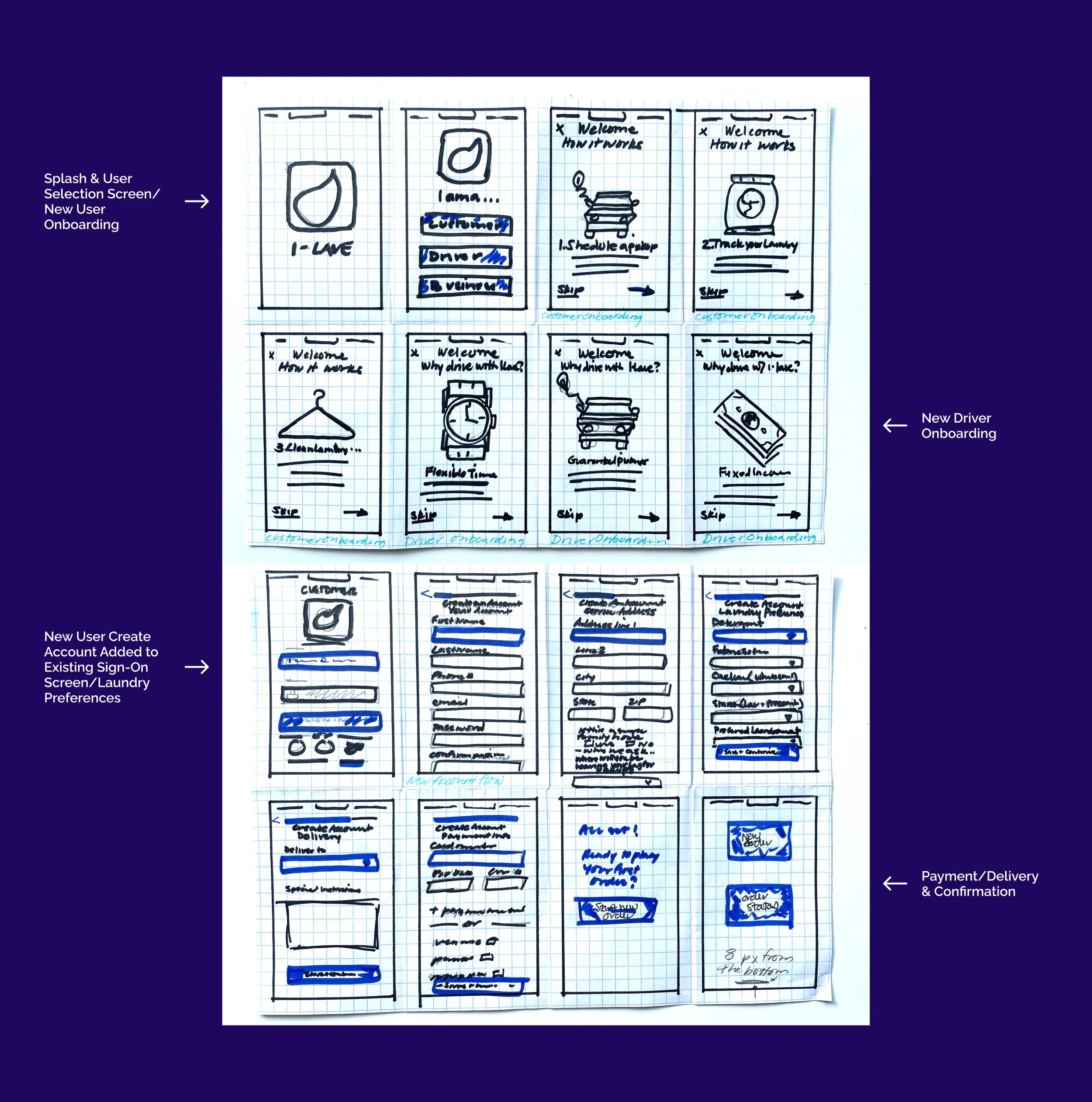
Sketches
Once I determined key focus areas I got to sketching. I wanted to make sure anything I added to the prototype matched existing designs so I tried to reuse some of the components and illustrations. By sketching my screens out first, I was able to set a plan of attack for the rest of the build.
The Build
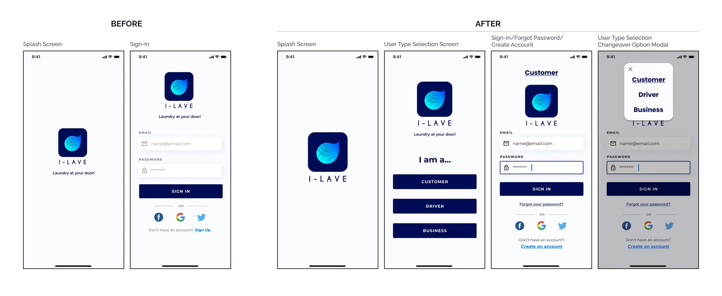
After I sketched out the framework, I got to work in Figma. I started by redesigning the splash page, losing any unnecessary copy and enlarging the logo.
Since !-Lave was essentially three apps in one, I had to find a way for the user to select their correct path, which would then make way for first time user on boarding, followed by the sign-in/create account screen.
I also gave the user the ability to change paths on the sign-in screen.
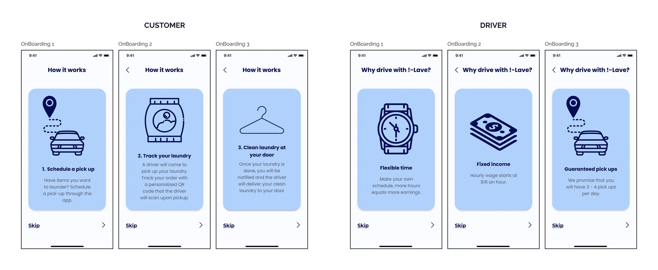
On Boarding
Competitive analysis of other laundry and driver services revealed clear onboarding for new users. These were screens that detailed right away the added value of the app.
Simple and quick, these screens were the introduction we needed to get the user familiarized with the platform. I created two sets, one for the customer side and one for the driver side. I used illustrations to showcase key features.
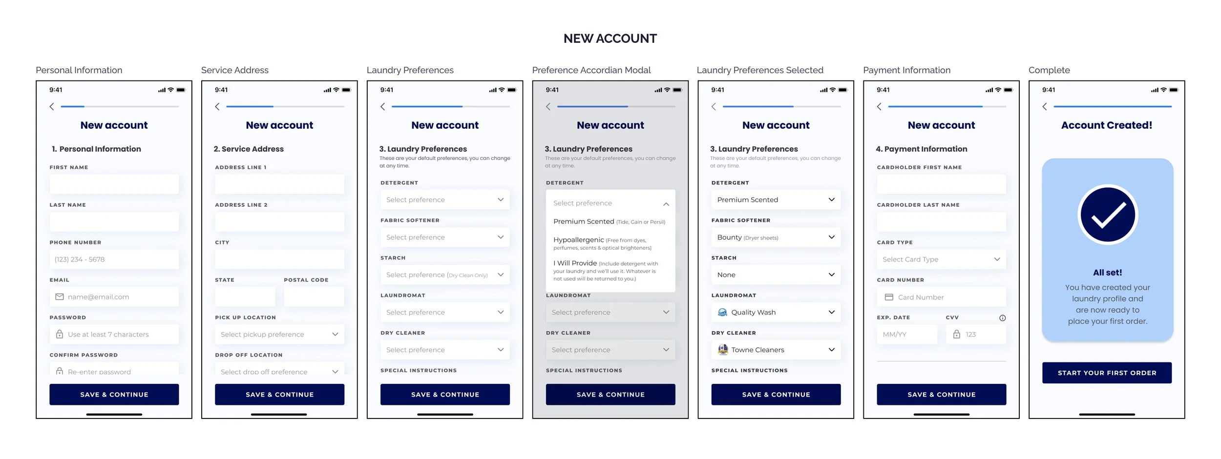
Account Creation
As a new app, !-Lave needed a way to collect baseline information from new users in order for them to place their first order. This information included such things as, name, address, laundry preferences and payment type.
I tweaked existing field components, adding empty, active, inactive and error states to create the forms. I focused on the customer side as I had learned through my competitive analysis the type of information required to get started.
Usability Test Prep
Prior to testing, I made a prototype using the new onboarding and new account screens that I worked on as well as existing “new order” screens. I wanted to use existing screens without iterations to confirm consistency and fluidity in visual design (to make sure the design came across as one idea and didn’t feel disjointed) and test my hypotheses from the Heuristic analysis that the existing screens lacked clear CTA’s and sufficient feedback for the user.
User Testing
User testing consisted of 5 participants. One was moderated in person and four were conducted as moderated remote via Zoom. Participants were asked to perform certain tasks and share their screens as they talked their way through the prototype. Each interview lasted about 30 minutes.
Participants were recruited through social media and referrals from acquaintances. Users fit the criteria as a person who would be interested in using or is currently using a pick-up and delivery laundry service or any other drop off laundry service such as dry cleaning or wash and fold.
Tasks
Determine what actions you should take if you were a first time user looking to set up an account.
Place your first laundry order.
Can you explain to me what you need to do to prepare your first order for pick up?
Feedback & Findings
Findings were consistent with my hypothesis of insufficient feedback and confusion throughout the order placement process.
All users were able to complete the first task. They were able to locate the CTA to create an account and then follow through with the registration process.
As for the second task of placing their first laundry order, users eventually were able to get through the flow, however, there were key screens at which all five users got “stuck” due to lack of feedback and a confusing selection process.
Lastly, I learned that more content was required in terms of helping the user understand what they needed to do to prepare their first order for pick up and how to contact their driver or service provider for questions.
Final Iterations
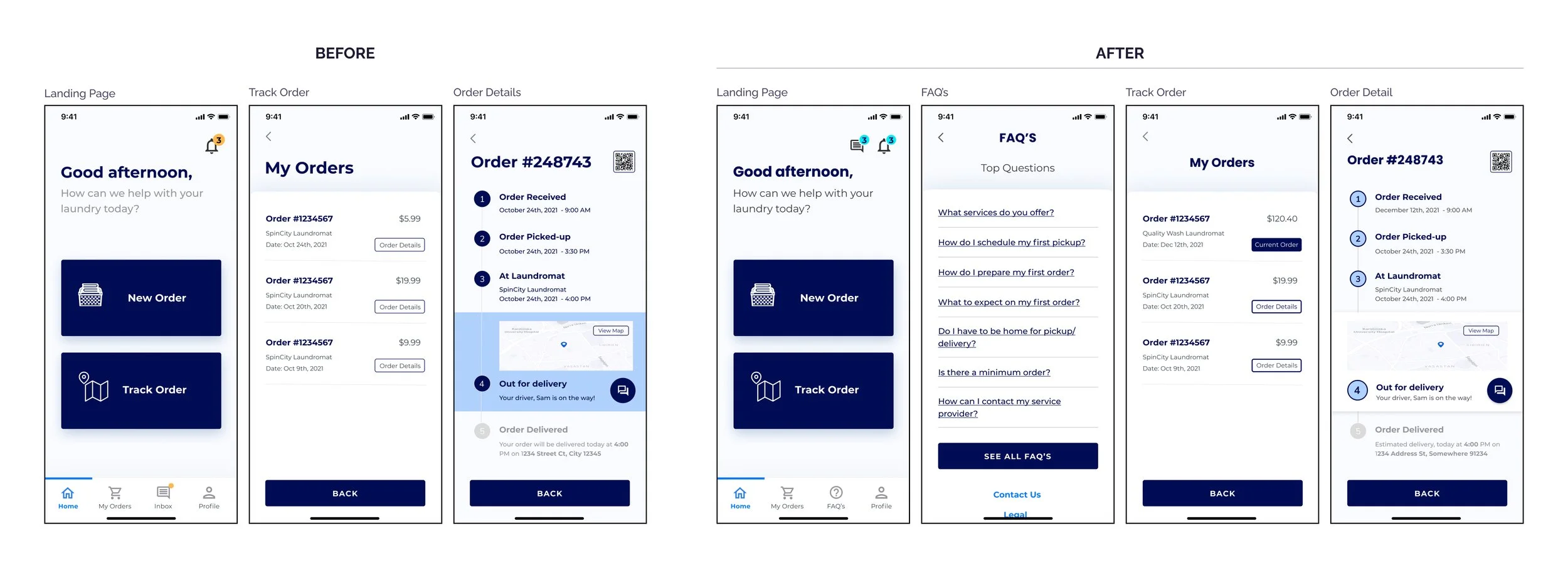
I felt comfortable with the new user registration flow and made minor iterations. I then focused my attention on the new order flow as that revealed itself to need the most work around accessibility and feedback.
To start, I darkened the grey text to meet WCAG compliance standards. I then added a FAQ’s icon and screen to the bottom navigation bar. I also cleaned up certain CTA’s on the “My Orders” screens so the user would have a better understanding of what is “clickable” and what isn’t.
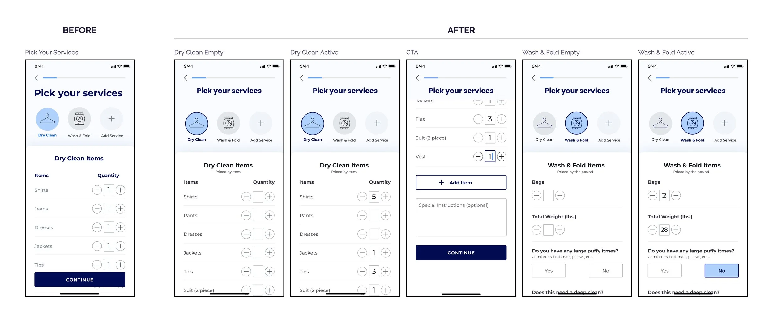
Service Selection
The service selection screen existed as a single screen in a seemingly active state. To that, I added an empty state, so when initiated, the user had the understanding of having selected a service and emphasized the selection by adding an outline in the primary !-Lave blue.
I also created a “Wash & Fold” screen to which I added copy to help the user understand how they would be charged as I learned through user testing that dry cleaning and wash & fold are priced differently.
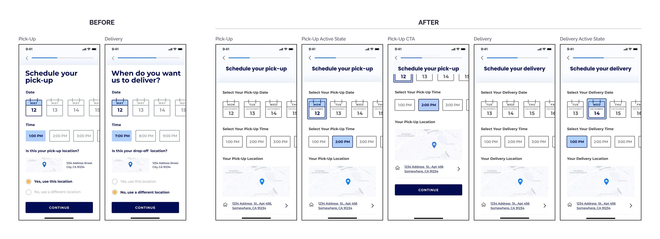
Pick-Up & Delivery
Once again, I added inactive and emphasized the active states on the pick-up and delivery screens. I made sure to include the day of the week to the calendar since users indicated it was a necessity for clarity.
Lastly, I updated the pick-up and delivery location to reflect as a default instead of having to confirm each time an order is placed.
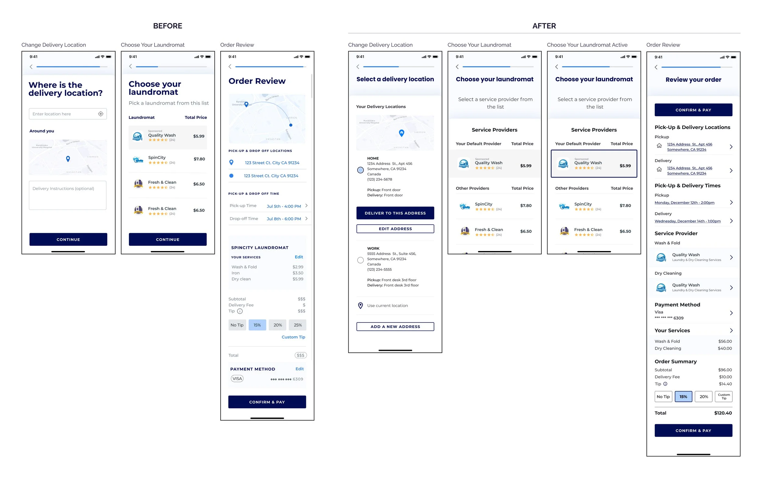
Location Change, Laundromat & Order Review
There were two screens where during usability testing, users essentially got stuck. The first was the delivery location screen. No feedback was provided when the user clicked in or around the screen. They were able to hit “Continue” and move forward, only after they went back and forth a few times to try and understand what was happening.
I redesigned the screen to only come up if needed via the address link/arrow on the pick-up and delivery screens. I included the default delivery location, as well as the ability to add and save another location.
The second problematic screen was at the laundromat selection page where lack of feedback upon tap/click made it so the user was directed to laundromat reviews instead of getting feedback that a selection had been made. I created an active state, while maintaining the ability to click on the stars for reviews.
Lastly I addressed the consistency in links, I made them all the primary blue with an underline and/or an arrow to be in line with platform conventions, something the user would recognize as a clickable.
The Handoff
Although I had been in constant communication with the team through Slack and Discord, I used Zeplin to document and prepare my designs for implementation.
Additionally, I updated the style guide and started an inventory of components and patterns since at the time !-Lave had no component library or design system in place.
Final Thoughts
My work for !-Lave was a great exercise in flexibility and agility. I started off as sole designer then pivoted to collaborating with a team brought on to work through the rest of the build. I was tasked with onboarding and guiding them through the remaining critical areas of focus. It was great being able to communicate and lead a team again.
Overall, I was extremely pleased with my experience working for !-Lave. As always, I am humbled and thankful for the opportunity to work on a cool product with a great CEO, designers and engineers.